
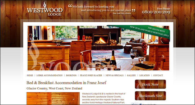
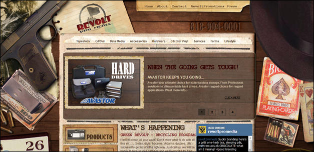
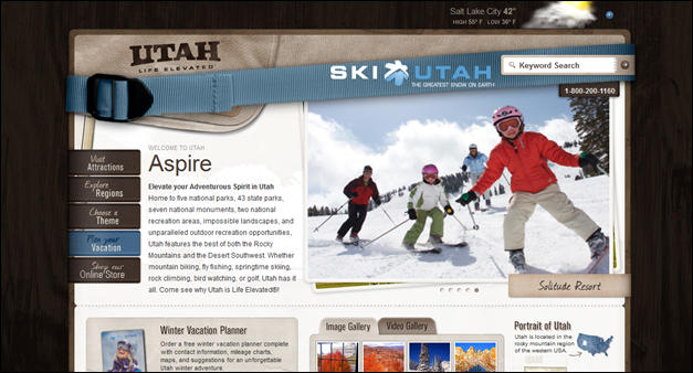
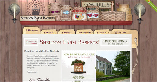
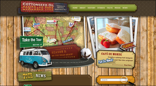
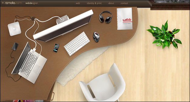
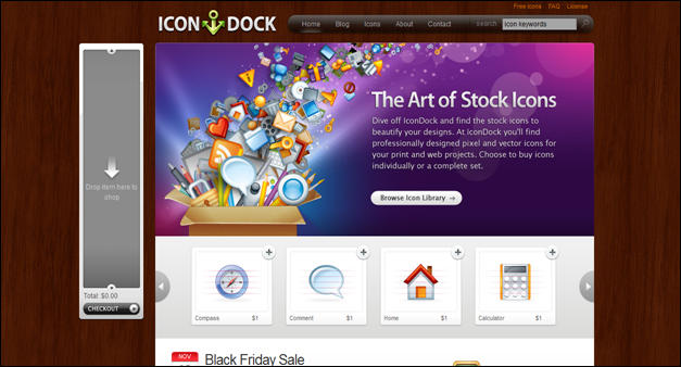
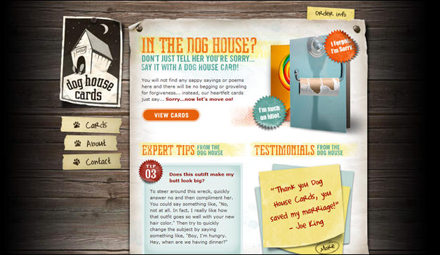
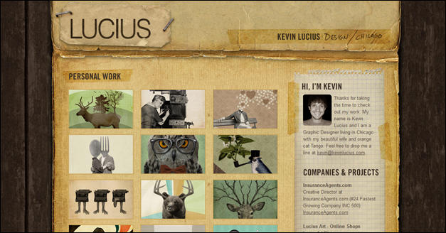
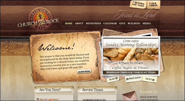
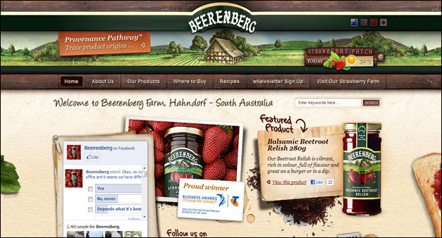
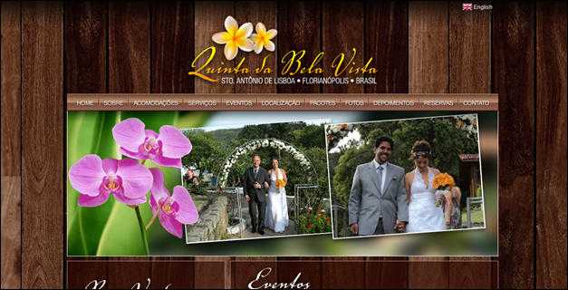
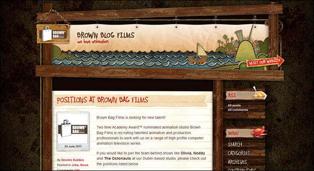
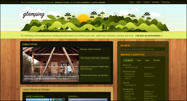
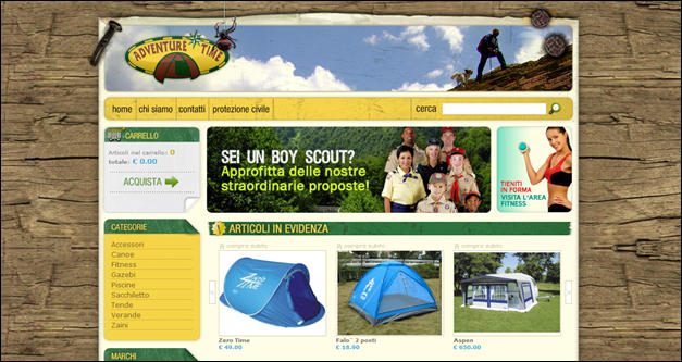
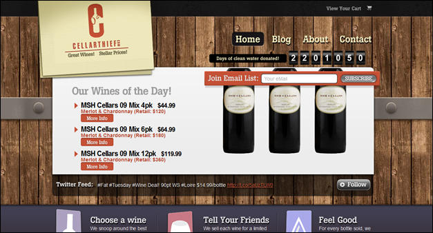
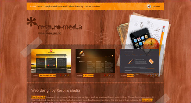
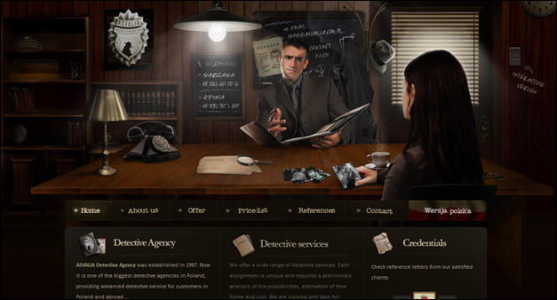
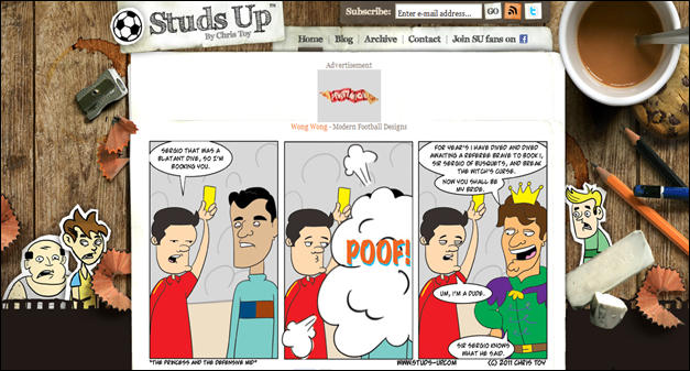
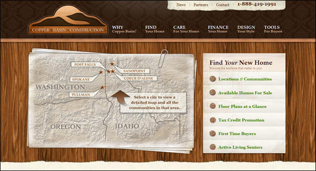
If you were to surf the web, you will see from time to time, websites that use wood texture on their layout. You can see that wood texture is integrated on the header, sidebars, footer and as a background as well. Not only that, you can also see wood texture icons displayed on some websites. This pervasive adoption of wood in web design only shows that it has a distinct appeal to most people.
Wood texture provides a touch of novelty and evokes a feeling of nostalgia towards the bygone era and all things past. Also, wood texture tends to be more personal and affectionate compared to hard looking texture like metal or stone. Thus, it stirs emotions, and encourages positive results on the part of the audience.
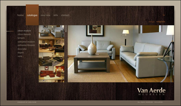
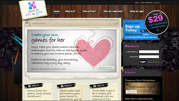
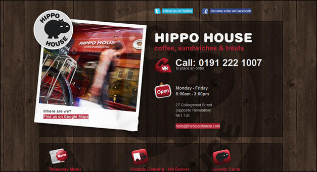
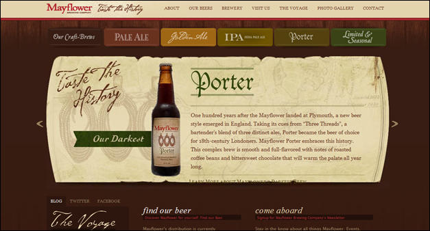
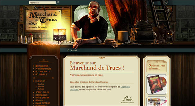
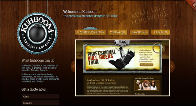
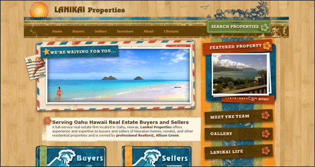
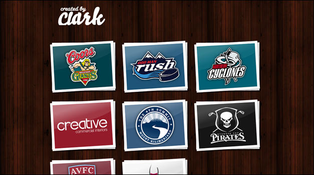
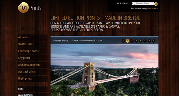
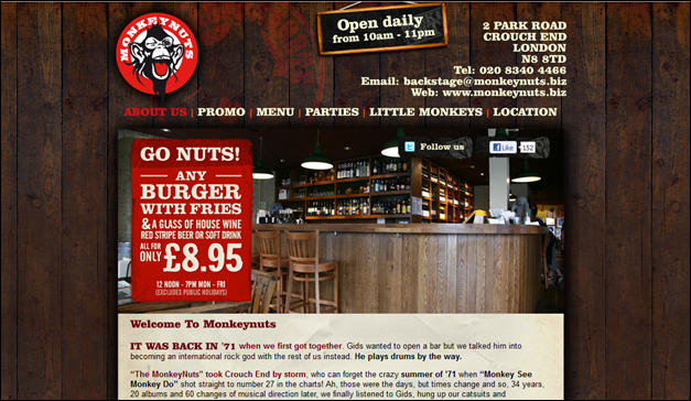
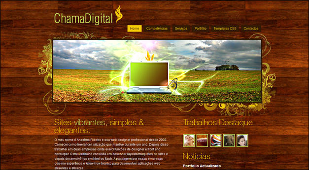
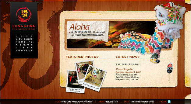
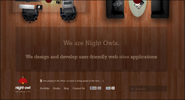
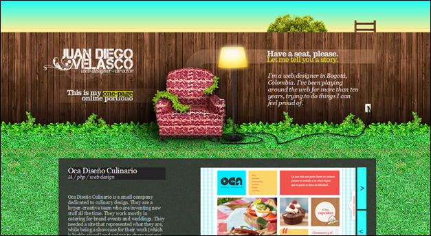
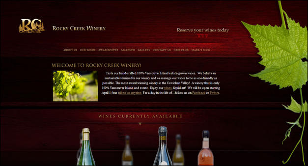
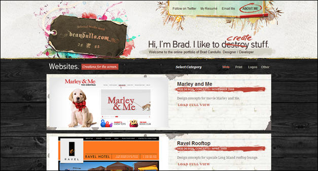
Here, we are showcasing some examples of websites that effectively use wood textures on their designs. Wood textures often find their way into travel websites or personal portfolios. I think that may find templates for travel websites useful and maybe website templates for showcasing photos. In this post you will see that wood texture can dramatically improve the look and feel of a website if done correctly.
Meanwhile, as you go over this article, we are encouraging you to please help us share this post by clicking our social media buttons. You are also welcome to share your comments and opinions below. Enjoy!









Recent Comments
30+ Exciting WordPress Gaming Themes – Want Unfair Advantages?
60+ Beautiful Tri-Fold Brochure Designs and Premium Brochure Templates
30+ Exciting WordPress Gaming Themes – Want Unfair Advantages?