
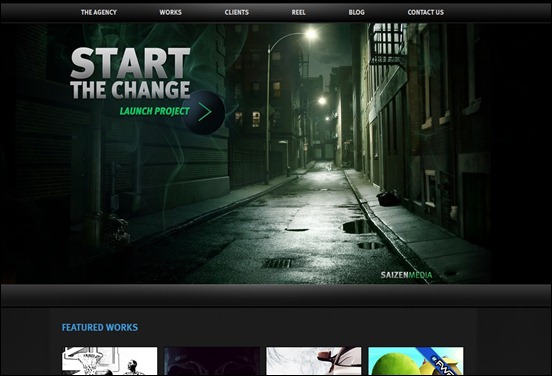
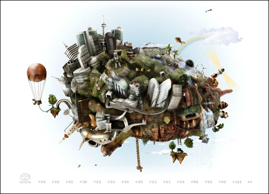
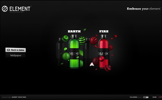
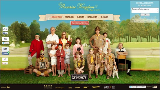
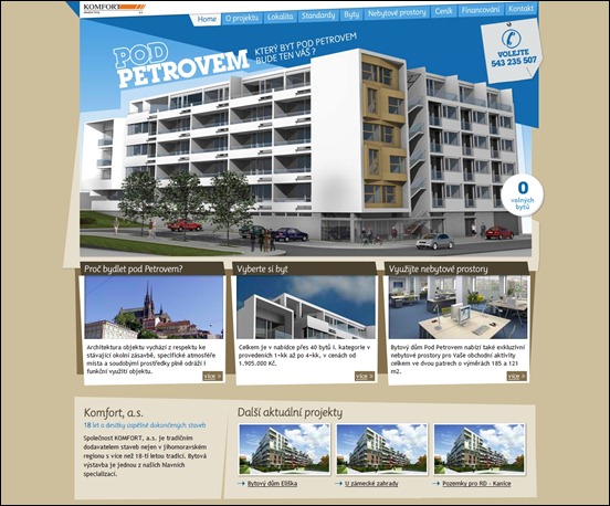
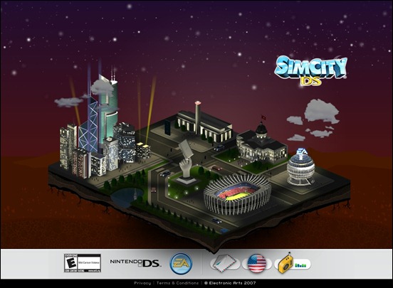
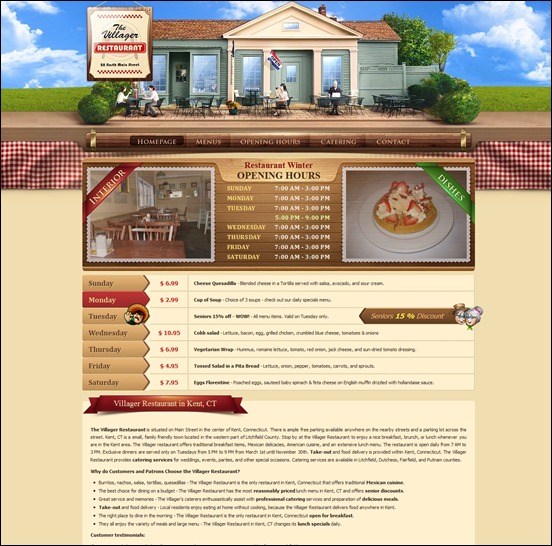
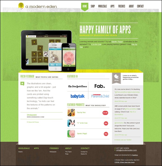
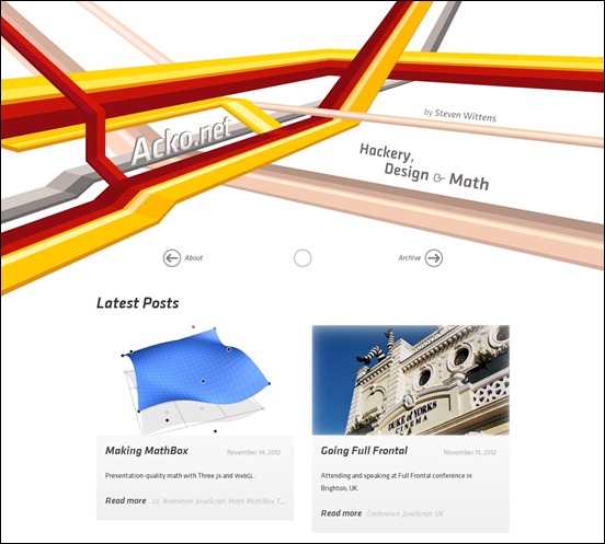
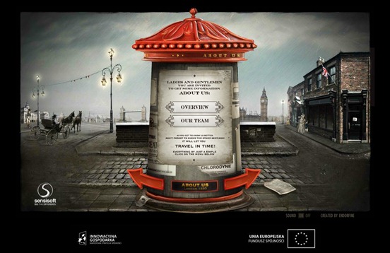
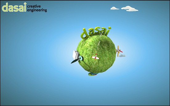
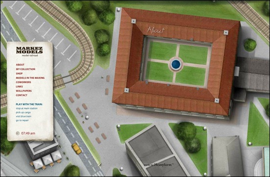
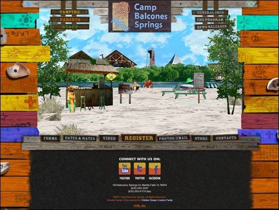
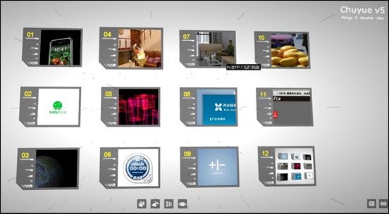
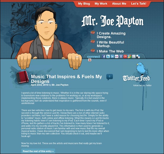
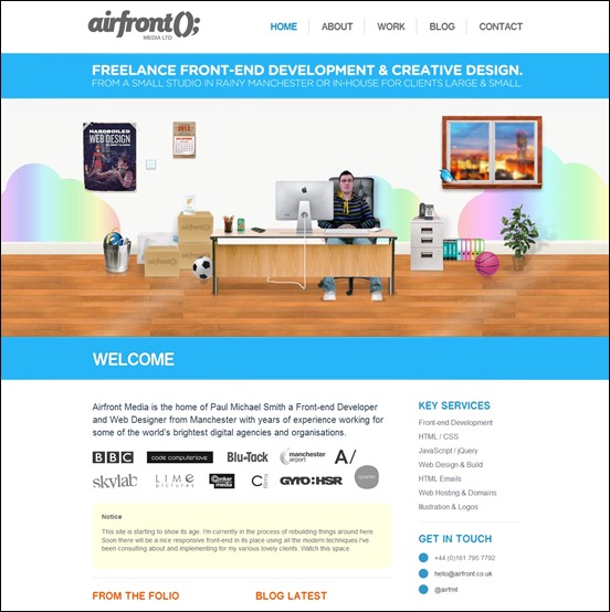
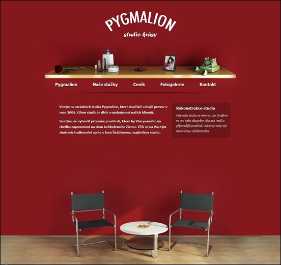
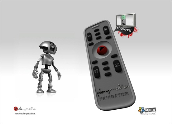
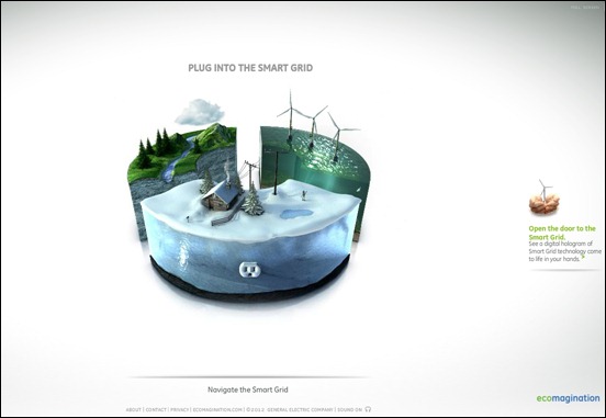
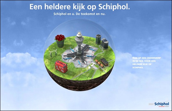
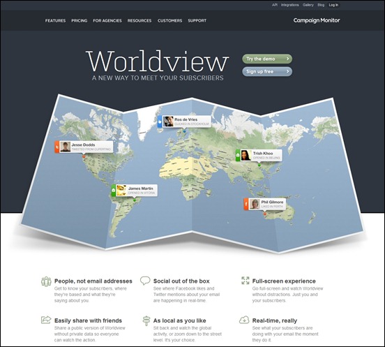
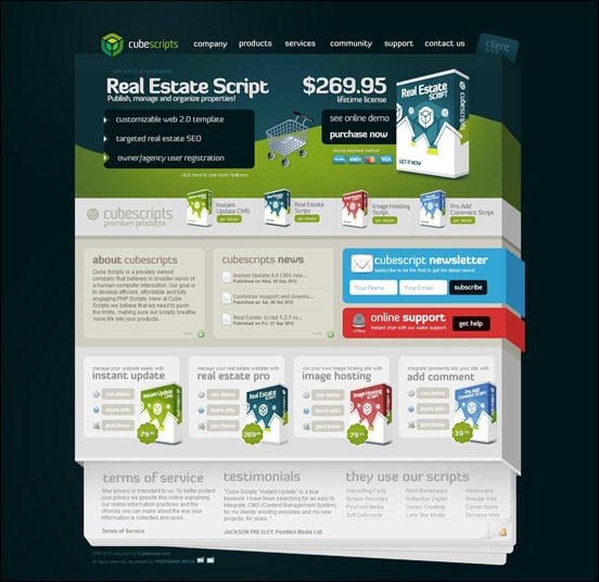
3D effects in movies and home theater has become increasingly popular these last years and now the trend has also spread to the web designs. The primary reason why some designers choose to apply 3D elements is to create a feeling of depth to their web pages. While most websites still use a flat, two-dimensional design, the usage of 3D elements may stand out as more unique, appealing and interactive.
In today’s post, we have rounded up some of the awesome examples of 3D websites that effectively create the illusion of depth and realism in their design. Another technique used by web designers that frequently creates 3D viewing experience is parallax scrolling. This technique makes background elements move slower than those in the foreground, creating a nice animated 3D illusion in the process. The Parallax effect can sometimes be found in a fullscreen WordPress theme or photography theme. this way you can set up a unique and outstanding website at a low cost. You can see how the parallax scrolling trend in web designs are implemented by observing the websites we have featured in a previous post.
For seriously cool examples of 3D effect even in static pages, check these inspiring websites below. If you like this post, don’t forget to share it to your friends. You can also enrich this post by sharing your knowledge about the subject in the comment section below. Tweeting this post, stumbling and liking it in Facebook is of course highly appreciated.


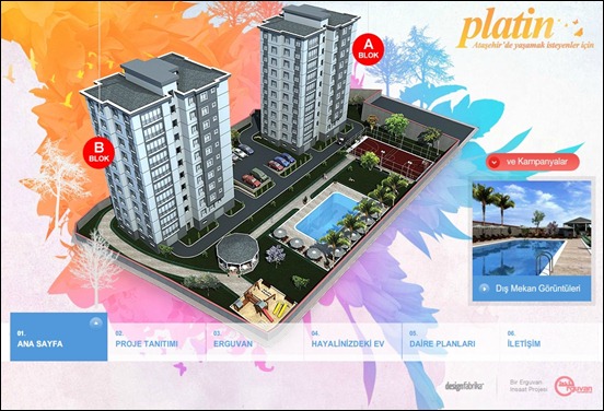

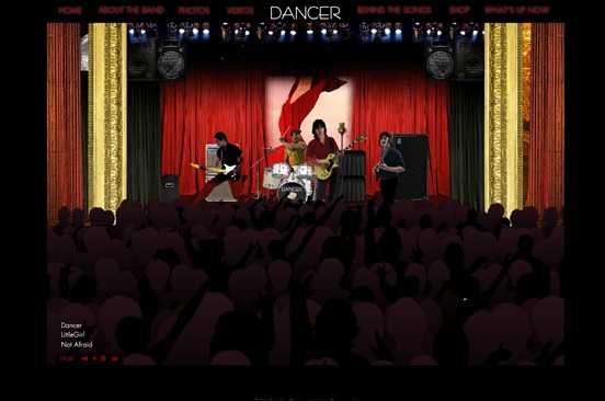
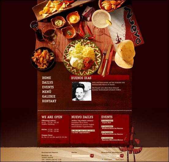
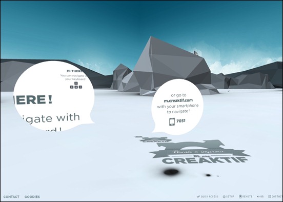
![immersive-garden[3] immersive-garden[3]](https://creativecan.com/wp-content/uploads/2012/12/immersive-garden3_thumb.jpg)
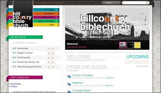
![13flo[3] 13flo[3]](https://creativecan.com/wp-content/uploads/2012/12/13flo3_thumb.jpg)
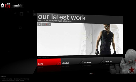
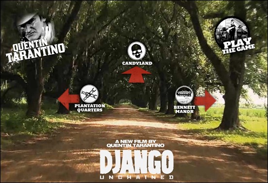
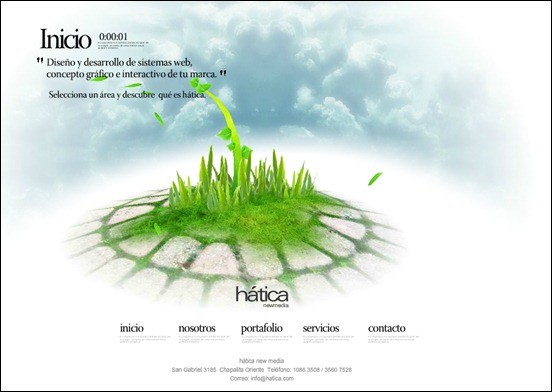



![meomi[3] meomi[3]](https://creativecan.com/wp-content/uploads/2012/12/meomi3_thumb.jpg)
![summer-festival-2013[3] summer-festival-2013[3]](https://creativecan.com/wp-content/uploads/2012/12/summer-festival-20133_thumb.jpg)





Recent Comments
30+ Exciting WordPress Gaming Themes – Want Unfair Advantages?
60+ Beautiful Tri-Fold Brochure Designs and Premium Brochure Templates
30+ Exciting WordPress Gaming Themes – Want Unfair Advantages?