
Conventionally, we use black text over a white background—this is the user-friendly way. In this manner, people can read the words and phrases because of the wide white space. That’s why most websites have white or lighter backgrounds. But, nowadays, there is a trending design: Dark Websites!
Well, you cannot expect to get the same “user-friendly” feeling with black background as it is not easy to read and there is a kind of darkness sensation which is not relaxing for some Internet users. Even if it has equal spacing, still the feeling can get more claustrophobic.
Fortunately, there are web designers who tried to surpass this understanding. They have made darkness attractable. They created more hip, strong, edgy, and bold designs which are all irresistible to the eyes of Internet visitors. Their dark designs are very alluring, making it more profitable to the client. Here are 25 dark website designs that will change your perspective to black themes — see for yourself why these surreal themes makes web designers richer than ever. Gaming websites are often dark, as well. Therefore, when you are done browsing this article, then go to our gaming theme for WordPress collection and see how it can be done as well.
AdaptD
AdaptD has an artistic design. Its background color is not black but dark navy blue. Its elements have several colors on it such as red, orange, blue-green, green, light green, and white. Its fonts are very liberated which make the whole design so attractive to internet surfers. Though there are several elements, the whole theme is actually very light.
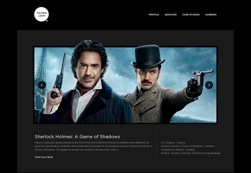
Think Jam
Think Jam is among the pioneers in dark web designs with a world-class reputation and has drawn many creative designers, fussy developers, fanatical publicists and an over the top management team based in Los Angeles and London. This award winning digital marketing agency executes all aspects of creative designs in dark themes and boasts its roll call of clients from the film industry, celebrities to corporate entities such as the Sherlock Holmes, J.K. Rowling and A Dangerous Mind to name a few.
Worry Free Labs
Worry Free Labs is one of those dark website designs with black theme and advanced elements and layout. There are 3D touches with clear and white font style. The green color of the logo makes it perfect on the faded black background. And although, it has darkness all over it, it’s not vague at all—the topic and the subject can be delivered clearly to the internet visitors.
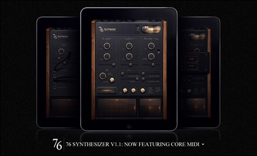
76 Synthesizer
76 Synthesizer is one of those dark website designs which make black deign a very serious matter. Well, black is indeed fashionable. It has elegance all over it. Especially 76 Synthesizer, there design has a 3D touch wherein three tablets stand while making an illusion that they are standing on top of a glass—it’s pretty amazing.
Let It Bleed
Let it Bleed is true to its name. the whole design is dark yet the highlighted elements are in red, giving the sensation of bleeding. However, though how simple the main theme is, the whole design is fantastic and attractive: the images are in 3D, the font is clear and printed, and the navigation is so advanced.
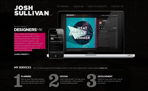
Josh Sullivan
Josh Sullivan is a designer and developer for 5 years now and has continued to create interesting web designs, mostly in dark themes, and provides absolutely exceptional solutions to niggling design problems. His recent project, Designers MX, of which he is also the co-founder, flaunts its black elegant cover design with a tab and smartphone images displaying the latest trend not only in music and gadgets but in web design as well.
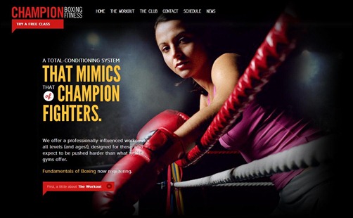
Champion Boxing Fitness
Boxing always has a sort of darkness on it. It is just fitting to use dark website designs on sport pages like this. The Champion Boxing Fitness theme has dark steel background with contrasting font colors like white, yellow and red (making it bloodier). There’s a man on his practicing globs, adding to the fierceness of the page.
Cleo Annex Salon
Cleo Annex Salon has the dark yet girly kind of design. It has dark gray background but it has touches of violet. It’s like a fierce girl’s website. The font used is very boyish yet the violet colors around the whole design make it very girlish. This is a salon different from its flowerish competitors, which gives it an edge.
Power of One
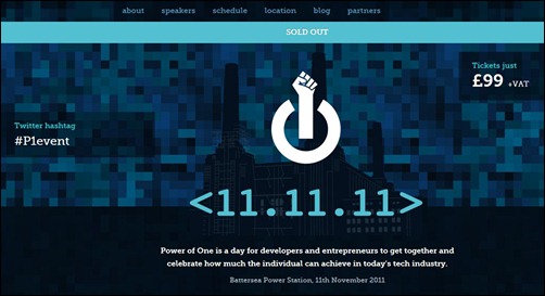
Power of One design is not actually centered in the black color. However, the overall feels are still darker. Its chosen colors are sky blue, dark blue and navy blue. He font colors are white and sky blue.
The blueness makes it more attractive—dark yet still easy in the eyes.
Societe Perrier
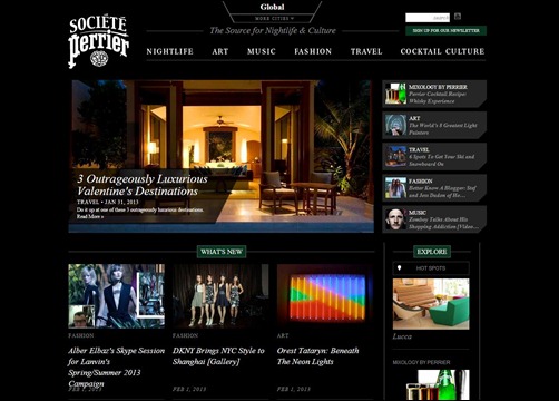
Societe Perrier is a one stop shop where you can get global information in arts, music, fashion, travel, nightlife and cocktail culture. The stylish and elegant look of the cover design in black makes it more appealing to party goers, art lovers and backpackers.
Certainly, this is a worldwide source for everything you want and need to know about a world class clubs, bars, hotels and awesome destinations for a great vacation.
Dgzoo
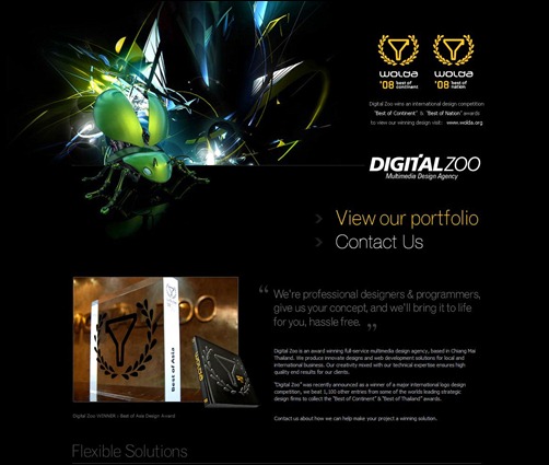
Dgzoo is dark and rockin’. It has black background but the elements are very 3D-like and futuristic. By using yellow font color and green elements, the design becomes as advanced as ever. There’s a 3D robotic bug which added in the overall digital theme. The font used is unusual—you haven’t seen this style before, it’s totally futuristic.
Danogborn
Danogborn is one of those dark website designs which are both dark and simple—making it more understandable and reachable. The fonts used are clear. The background is not that grim—it used gray as the main thee. There’s a fierce image of man biting something but that just add in the mystery of the whole design.
Nelson Cash
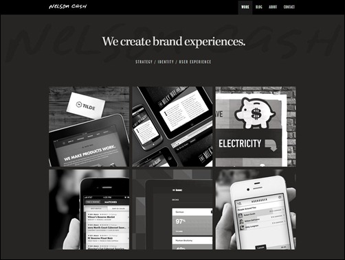
Nelson Cash is composed of a clever group of designers, developers and consultants based in Chicago. What started out as a happy hour sessions of modern minds has now produced an enormous studio creating brand experiences with great collaboration and innovation offering strategy, branding, interface design, development, mobile applications and information architecture.
Gangibob
Gangibob is an awkward yet amazing dark design. The font used is unusual—you usually see it on old live shows in the 40s. It’s kind of messy but the scattered elements make the whole beautiful. The designer wants to depict an old cinema feel that’s why the images are in black and white there are some grain designs all over.
Bogdan Teodorescu
Bogdan Teodorescu has an out-of-this-world design. Well, that’s quite literary because it has the beautiful ark universe as its background. There’s a touch of violet all over, making it more attractive and elegant at the same time. The elements are also came out of nowhere—there’s a singing an in striped polo, giraffe, a surfing guy, an appropriately sized parrot above a wrecked car, and an air balloon.
Timothee-roussilhe
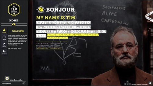
Timothee-roussilhe is a dark theme created by an Italian web designer. Actually, there is no specific theme or particular subject—it has various elements. But the whole dark-theme is all over it: Black and dark gray background, and white and yellow font colors. What’s good with this dark theme is that the fonts used are all clear and readable.
Luhsetea
There will be no darker period in the American history than the gangster era in the 20s and 30s. Luhstea used the gangster feeling to make a darker yet attractable design. They even used the boothleg prohibition phenomenon in their own benefit by putting the phrase “tea bag prohibition”. There are also two dark cartoons (in shaded blue and red colors) complete with machine guns and suits.
Blue Cadet
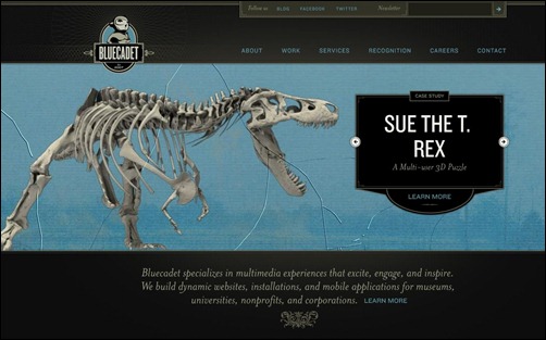
Blue Cadet is a dark theme with an elegant twist. It has all the dark elements such as dark gray background, and white and light blue font colors. However, there are elegant touches in the fonts and the layout of the page.
Blue Cadet, though it has darkness on it, is an appropriate theme for kid websites—this is because the elements used are not harmful for children.
Michael Korstick
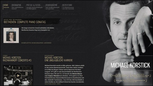
Michail Korstick is an international web page designer whose designs have been hailed by the community of dark website designs. Although it is dark, the elegance of the design is still there. Well, to begin with Korstick is from Europe—a continent where artistic magnanimity begun. Korstick’s design has artistic elegance all over it: the font is thin and clean, the background is light black with faded designs of scribbled words, and the images and videos are in black and white mode.
Adrian Baxter
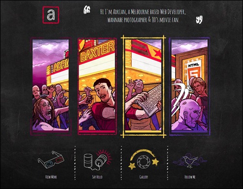
Adrian Baxter is a brilliant website designer. His designs have dark themes. This particular design has gravel gray background. The lines used are contrasting the dark backdrop—violet, red, yellow and blue. The elements are very artistic as it has drawings all over it—even the navigations are cartooned. The font used is the usual letters we see in comic strips.
Jet Cooper
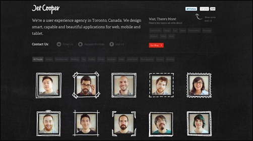
Jet Cooper design is a both comical and stunning. It is one of those dark website designs which are so simple that it is more effective and profitable for web clients. It has dark gray background, the fonts are clean and cute, and the layout is orderly (proper and exact spacing). What’s comical about it is the seemingly manmade drawing around the images, which makes the whole design catching in the eyes of internet visitors.
Kowalik
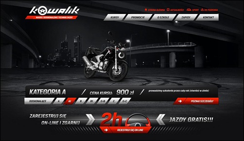
Kowalik is a dark website design with metallic-like theme. Its background is a 3D-like image of a city in the night. There are red colors in some of the elements making them stand-out and consistent with the overall design. This dark design is apt for vehicle-related companies specially those trucks that travel in the night.
Atom Bicycle Ltd
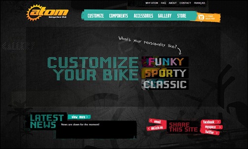
Atom Bicycle Ltd is a dark website design with funky sensation all over it. It has dark gray background with some kind of scratches, making it more artistic. Its font is futuristic and its chosen colors to contrast with the backdrop are very wise such as yellow, light blue, and pink.
Underground Evolved
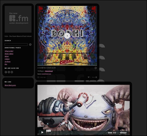
It’s like a real underground. The background is totally dark. It has gray lines but it is only to separate the elements from each other. The layout is very organized—it has specific spacing. What’s good with this design is that you can put so many elements in one page. Unlike the other dark website designs which only present limited images.
Palazzo Dallay
Palazzo Dallay is created by an Italian web designer. His dark design presents an entrance to an old building with two naïve children in front. The entrance and the children have the sole spotlight, making everything around dark. It’s so grim but at the same time very fashionable—capturing the elegant style of Europe.
Ten Thousand Things
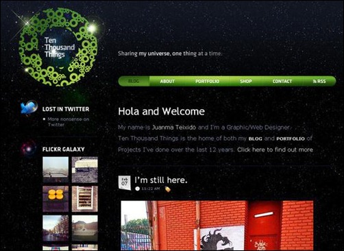
Ten Thousand Things is a galaxy-inspired dark website theme. It has the starry universe as its background. The green color on the other elements perfectly contrast with the dark yet shiny backdrop. The font used are clear and white, making it still readable despite the stars behind. The design around its title is also nice to ponder.
Nuemedia
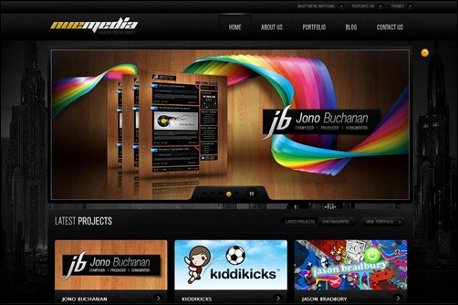
Nuemedia is a fantastic dark website design. It has 3D touches all over. The layout is futuristic yet funky. The elements are tight but there are designs which are out of context (like the monkey with a cap and a bling around his neck), making it more liberating and cool.
Kavoon
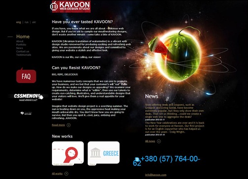
Kavoon is a dark website design with unorganized layout, making it more liberated—more free spaces for other elements. Kavoon is an apt design for blogs and article-related web pages. What’s alluring in this site design is the 3D image of an electrified watermelon, designed like a planet with several axis.
Mike Poss
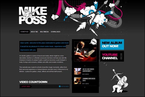
Mike Poss is a dark website design for musician. It is more apt for mellow rockers. The background is ramped gray and black. The other elements are colored white, pink and light blue. There is a beautifully drawn guitar with various artistic designs around it. The name of the site has a cherubim playing an electric guitar, showing the lighter side of rock n’ roll.
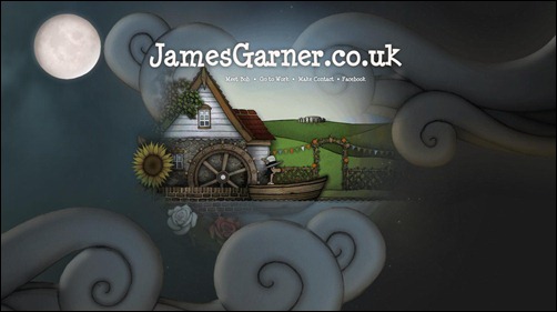
James Garner
James Garner is a UK web designer that has incredible dark designs. Actually, it’s not all black. It’s more of a dark blue kind of theme. But the mysterious elements make it fashionably darker. The images and drawings make incredible illusions which can allure anyone who pass through this website.


![AdaptD[1] AdaptD[1]](https://creativecan.com/wp-content/uploads/2013/02/AdaptD1_thumb.jpg)
![Worry-Free-Labs[1] Worry-Free-Labs[1]](https://creativecan.com/wp-content/uploads/2013/02/Worry-Free-Labs1_thumb.jpg)
![Let-It-Bleed[1] Let-It-Bleed[1]](https://creativecan.com/wp-content/uploads/2013/02/Let-It-Bleed1_thumb.jpg)
![Cleo-Annex-Salon[1] Cleo-Annex-Salon[1]](https://creativecan.com/wp-content/uploads/2013/02/Cleo-Annex-Salon1_thumb.jpg)
![Danogborn[3] Danogborn[3]](https://creativecan.com/wp-content/uploads/2013/02/Danogborn3_thumb.jpg)
![Gangibob[1] Gangibob[1]](https://creativecan.com/wp-content/uploads/2013/02/Gangibob1_thumb.jpg)
![Bogdan-Teodorescu[3] Bogdan-Teodorescu[3]](https://creativecan.com/wp-content/uploads/2013/02/Bogdan-Teodorescu3_thumb.jpg)
![Luhsetea[1] Luhsetea[1]](https://creativecan.com/wp-content/uploads/2013/02/Luhsetea1_thumb.jpg)
![Palazzo-Dallay[1] Palazzo-Dallay[1]](https://creativecan.com/wp-content/uploads/2013/02/Palazzo-Dallay1_thumb.jpg)



Recent Comments
30+ Exciting WordPress Gaming Themes – Want Unfair Advantages?
60+ Beautiful Tri-Fold Brochure Designs and Premium Brochure Templates
30+ Exciting WordPress Gaming Themes – Want Unfair Advantages?