
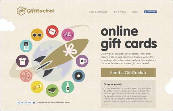
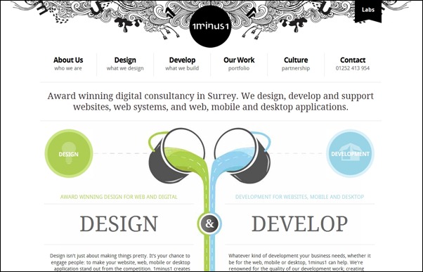
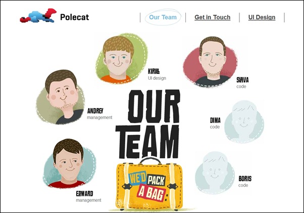
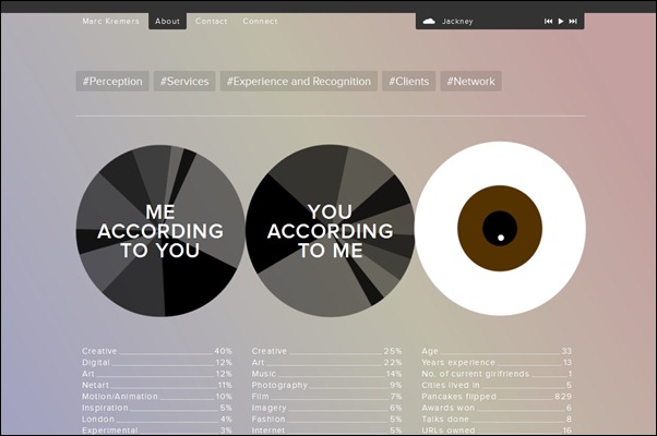
Creativity on how to use circle in web design is a skill, which is really useful. A skillful designer can use it to his advantage in making the overall appearance of his web page not only beautiful but also unique and interesting.
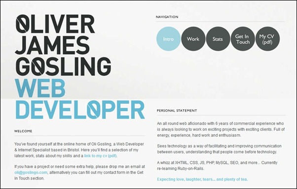
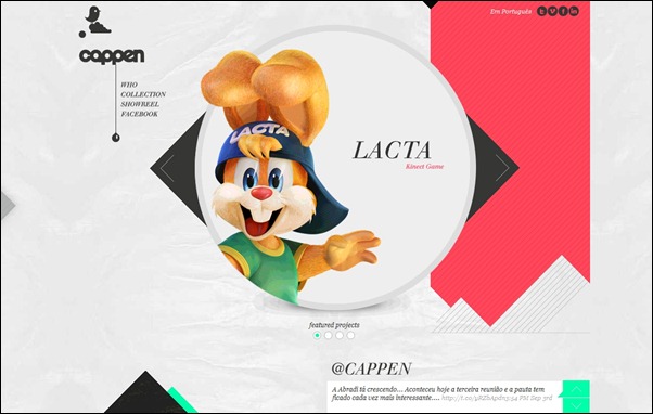
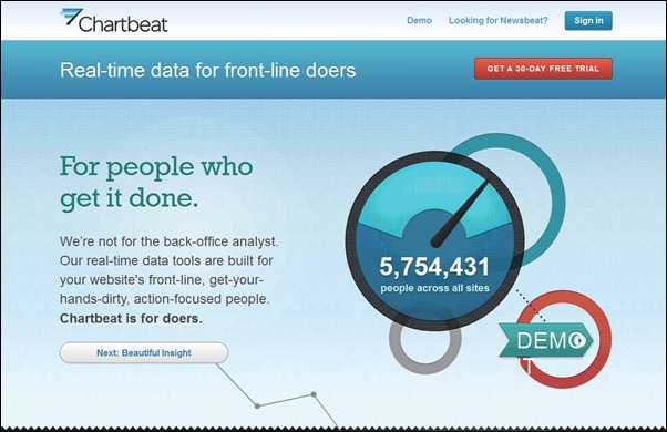
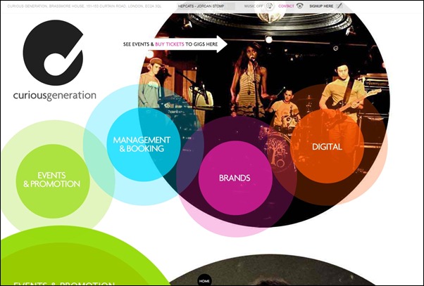
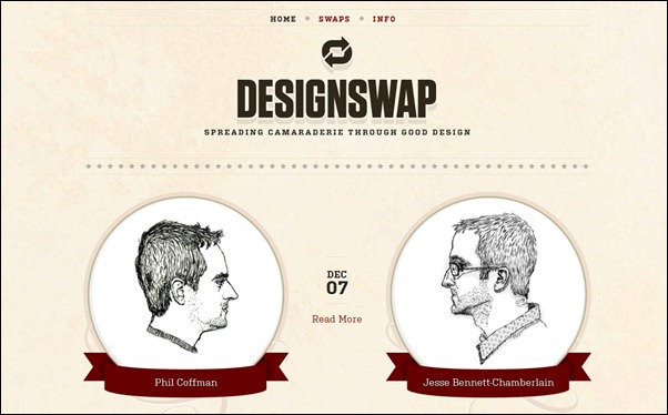
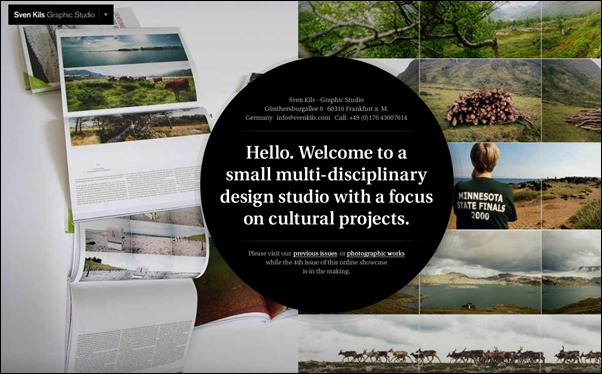
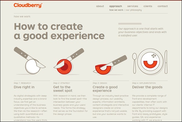
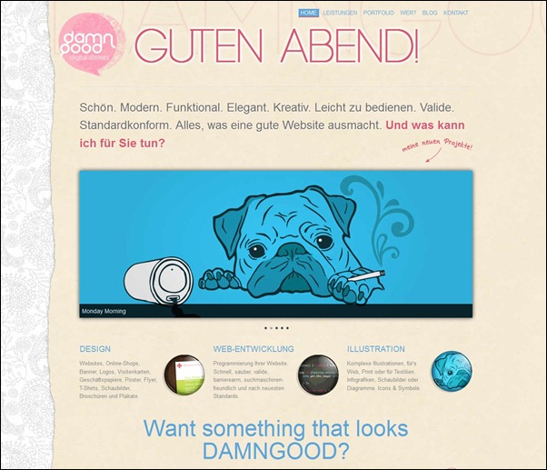
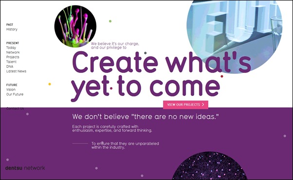
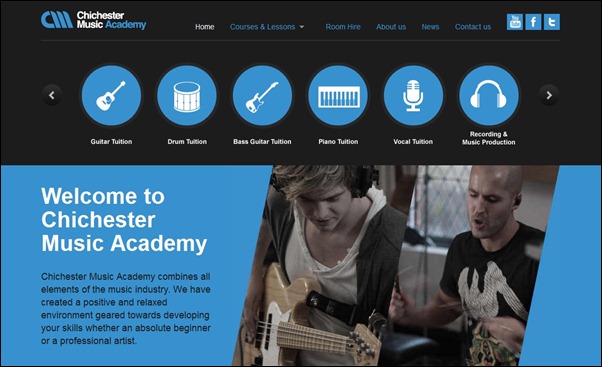
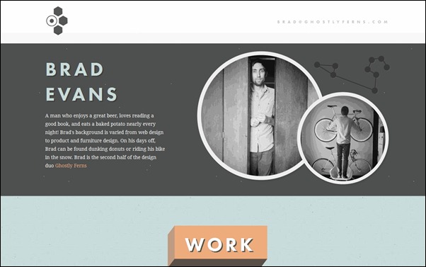
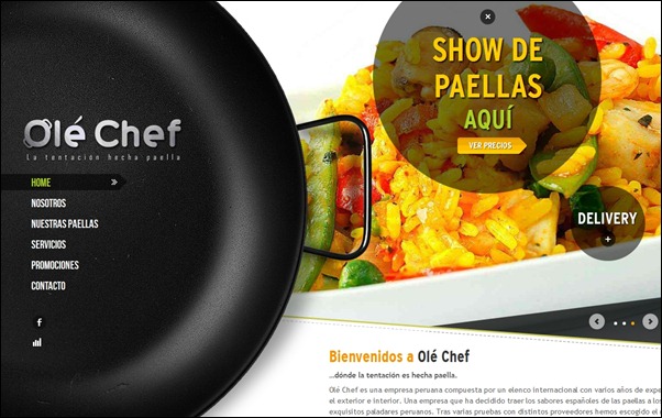
This is true in spite of the fact that circular elements has been used in many websites for quite some time already. Why the lowly circle has not lost its potential to make websites unique as they are is because of its high flexibility. That is it! The shape can be applied in unlimited number of ways, in different colors, shades and sizes, everywhere on a web page. It can be used to highlight icons, to create unique navigation and image displays, catchy menus and many more. Circular design elements are sometimes used in portfolio websites to and on about us pages to give photos a unique and interesting presentation.
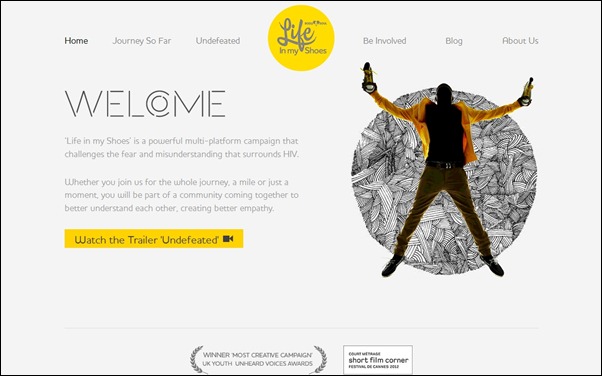
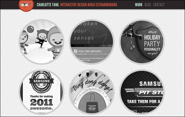
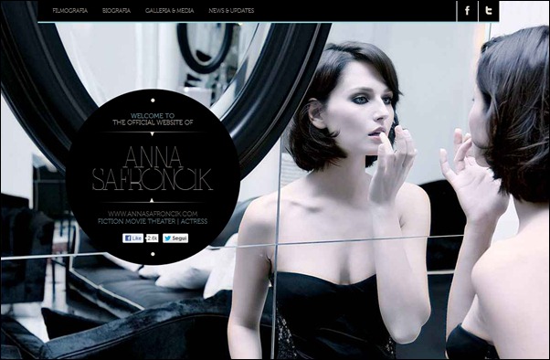
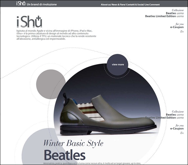
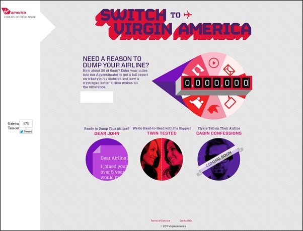
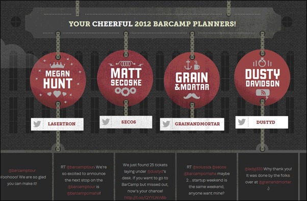
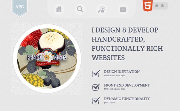
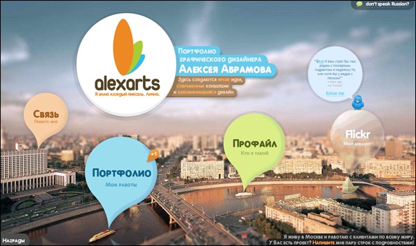
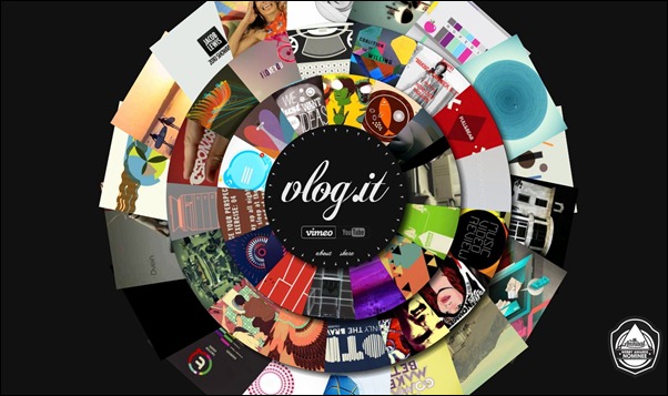
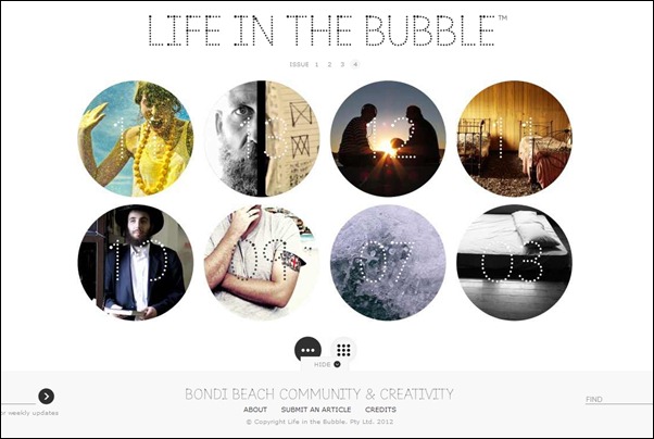
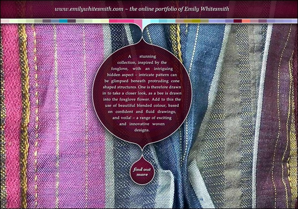
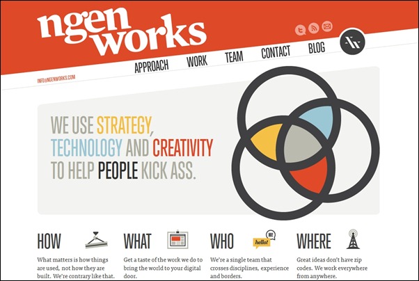
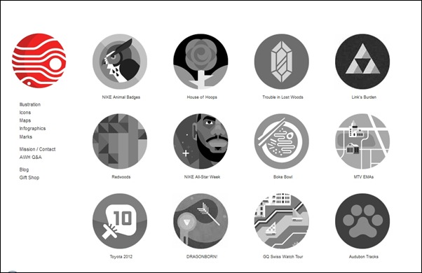
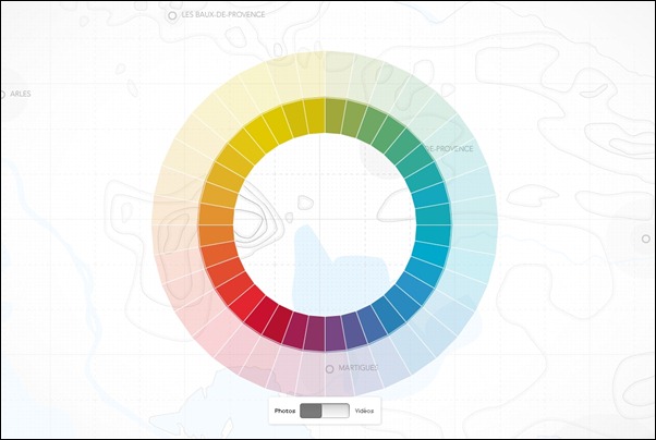
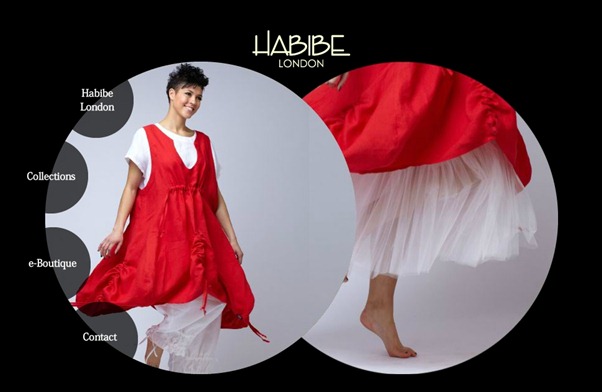
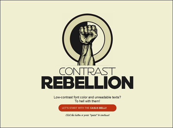
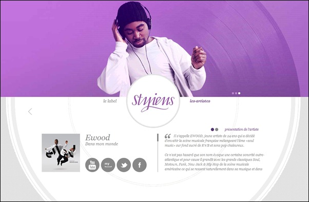
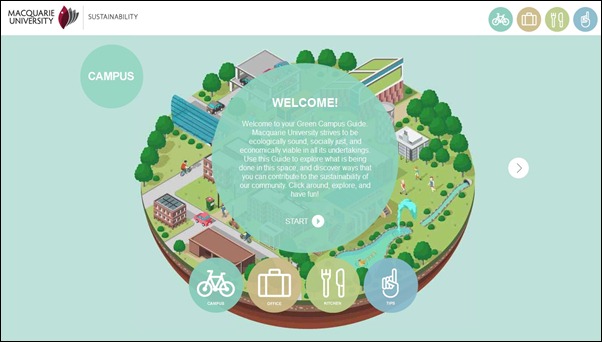
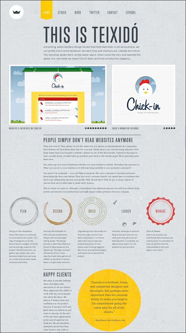
To give you an idea about some of the possibilities by which a circle can be implemented, we are sharing with these awesome examples of circular elements in web design. As you will see, the circular elements integrated on each website in a stylish, unique and creative method. Check these out and do not forget to share with us your observations. Enjoy!


![in-motion-massage[3] in-motion-massage[3]](https://creativecan.com/wp-content/uploads/2012/09/in-motion-massage3_thumb.jpg)
![column-five[3] column-five[3]](https://creativecan.com/wp-content/uploads/2012/09/column-five3_thumb.jpg)
![helen-and-hard[3] helen-and-hard[3]](https://creativecan.com/wp-content/uploads/2012/09/helen-and-hard3_thumb.jpg)






One Response to “40+ Great Examples of Circular Elements in Web Design”
September 11, 2012
himanshuGreat post.I shall try one of these to create it on photoshop