

Not long ago, serving a perfectly tailored layout to every visitor, no matter what device or browser he or she is using would have sounded like fantasy. However, today more and more websites make use of CSS media queries to offer visitors mobile friendly responsive layouts and it is probably going to be the industry standard. Designing and implementing responsive websites takes, extra effort and the techniques and responsive patterns are still immature. Therefore, you will notice that the quality of responsive websites vary a lot and some may look a bit broken on a few view port sizes.
One option for rolling a fully responsive website design out on a tight schedule and a minimal budget is to use predesigned responsive website templates (roundup @ tripwire magazine) or WordPress themes (collection @ splashmagazine). We also maintain a large set of responsive WordPress themes here at CreativeCan you should check out.
Before you make important decisions in your own project, it is always a good idea to look for inspiration by checking out the features and design of existing websites. In this article, you will find a large collection of high quality responsive websites for your inspiration.
ghosthorses – MORE INFO
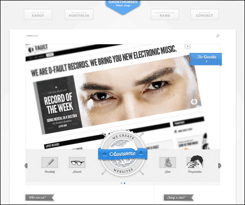
Cool example of how responsive webdesign can be made. The site was
Spark Box – MORE INFO

Spark Box is a web design company that is known for building websites that possess both brains and beauty.
Food Sense – MORE INFO
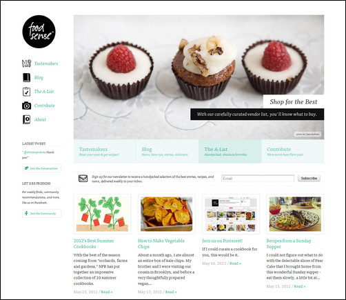
This is a magazine style layout that adapt nicely to the various screen sizes. Pay attention to the left side navigation that jumps to the top as the width is decreased.
Spigot Design– MORE INFO

Typetoken – MORE INFO

Responsive portfolio layout with a minimalistic design.
Dress Responsively, LTD – MORE INFO

Sasquatch Festival – MORE INFO

La Nina Polilla – MORE INFO

Café Evoke – MORE INFO

More Hazards – MORE INFO

Anna Hill Events – MORE INFO

This is an example of a semi responsive website that have a mobile friendly version, but not scales perfectly to all sizes in between.
Google “GOOD TO KNOW” – MORE INFO

A web site from the internet giant Google on online safety. It has a nice way of adjusting the elements for different screen sizes.
Clean Air Challenge – MORE INFO

Principle Property – MORE INFO

Responsive Design Weekly – MORE INFO

SIMON COLLISON – MORE INFO

Writer/designer Simon Collison has made a simple but a great-looking website with a grid based layout which is perfectly designed for scaling to different screen sizes.
Fitness Black & White – MORE INFO

Responsive wordpress design for fitness website.
MICROSOFT – MORE INFO

Sunday Best – MORE INFO

CREATE DIGITAL MEDIA – MORE INFO

Belong – MORE INFO

CODROPS – MORE INFO

Codrops is a web design and development blog, which provides Useful resources and inspiration for creative minds.
Xtremely Social – MORE INFO

TEIXIDÓ – MORE INFO

BUILD WINDOWS – MORE INFO

Build Windows a website from Microsoft made to stream the discussion on windows 8 app development.
BUILD RESPONSIVELY WORKSHOP – MORE INFO

This is a cool responsive dark website design from Spark box. The typography is great on this website and scales nicely.
A LIST A PART – MORE INFO
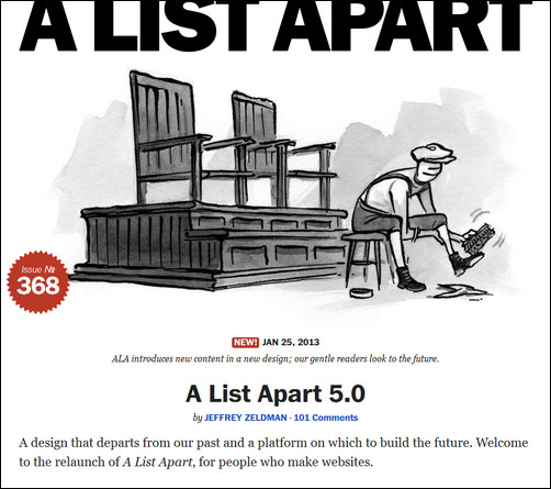
This is the most famous example that is being used to demonstrate responsive web design , made by alistapart for the article The Infinite Grid . This is a remarkable design.
Topman – MORE INFO

Topman Responsive celebrity website.
Gateway Bank – MORE INFO

The Ford Blog – MORE INFO

Boise State University – MORE INFO


Recent Comments
30+ Exciting WordPress Gaming Themes – Want Unfair Advantages?
60+ Beautiful Tri-Fold Brochure Designs and Premium Brochure Templates
30+ Exciting WordPress Gaming Themes – Want Unfair Advantages?