
Responsive layouts are gaining more and more popularity as the number of mobile internet users go up. Creating a responsive website is like taking a shortcut compared to creating one for every popular mobile phone and tablet. However, the task is not to be underestimated and some tweaking and testing will be needed to make the majority of mobile visitors happy. The best way to test responsive layouts is obviously by using the target devices, but since this is not always possible I recommend you consider using some responsive testing tools or emulators. You can also just re-size your browser window to do a simple test of how a responsive design adapts to various screen resolutions. It is also a good idea to test preview sites if you are considering getting yourself a WordPress theme with a responsive layout.
I recommend that you check out some examples of great responsive designs and check out some of the tools below on these sites. This will help you understand how they work and give you some inspiration for designing responsive web design.
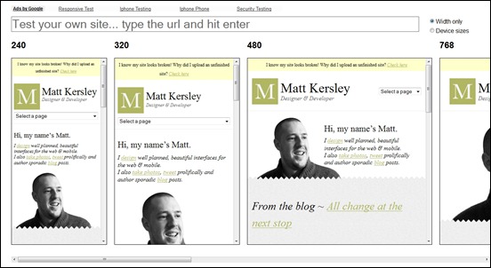
Matt Kersley Responsive Web Design Testing Tool – MORE INFO
This tool has been built to help with testing your responsive websites while you design and build them. You can enter your website’s URL into the address bar at the top of this page (not your browser’s address bar) to test a specific page.
Opera Mobile Emulator – MORE INFO
Developing for mobile phones and tablets becomes a breeze. The emulator is super simple to install and lets you do serious mobile development from your desktop. Use the profile selector to spawn multiple Opera Mobile instances with a defined resolution, pixel density, user interface and more, and save your settings as profiles for future testing.
ProtoFluid – MORE INFO
ProtoFluid simplifies the development of fluid layouts and adaptive CSS using Media Queries. It works within your website, HTML5 app or game in the form of a single JavaScript include.
Responsive.is – MORE INFO
Responsive.is emulates the appearance of your web design in a predetermined screen sizes.
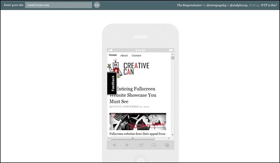
The Responsinator – MORE INFO
The Responsinator produces the appearance of your web page in different screen sizes in a fly. You only have to enter your URL and it will display the view of your web design.
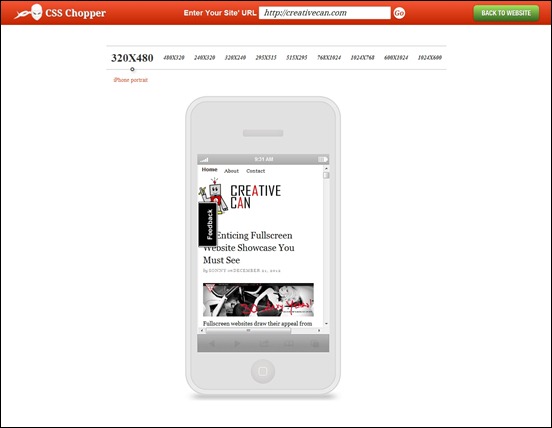
CSS Chopper – MORE INFO
Test your website easily in this responsive design tester. All you have to do is to enter your URL and click on the desired browser window that you want to see.
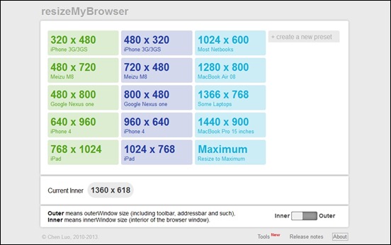
resizeMyBrowser – MORE INFO
As its name suggests resizeMyBrowser allows you to resize the browser in any of the screen sizes of mobile, tablet, and desktop sizes.
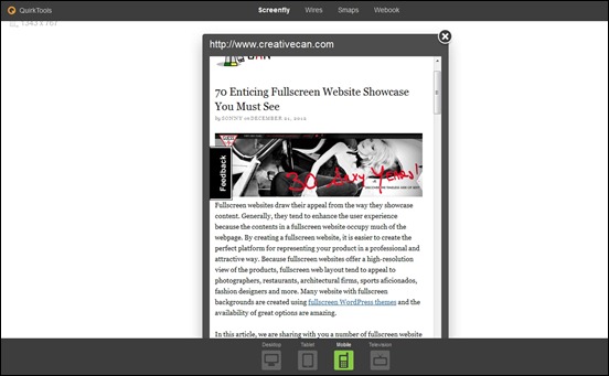
Screenfly – MORE INFO
Screenfly is an emulator that alllows you to test your design in a number of devices and view port sizes. You can test your page in different phones, tablets, and desktop screen resolutions.
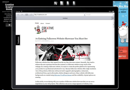
iPad Peek – MORE INFO
As the name says, iPad Peek will let you see how your website looks in an Apple iPad.
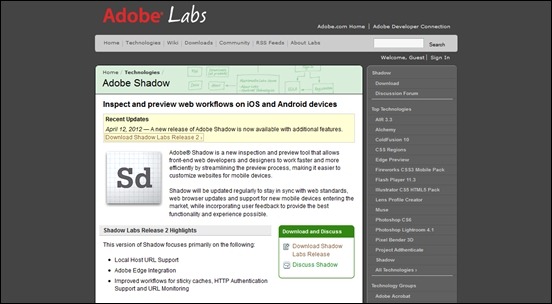
Adobe Shadow – MORE INFO
Adobe Shadow is a new inspection and preview tool that allows front-end web developers and designers to work faster and more efficiently by streamlining the preview process, making it easier to customize websites for mobile devices.
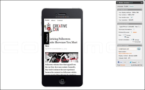
Mobile Phone Emulator – MORE INFO
Mobile phone emulator will allow you to display your website in different screen resolutions by clicking a the ideal screen size of the mobile phone.
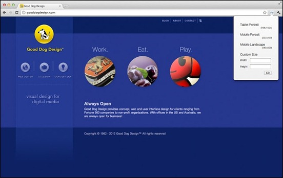
responsiView – MORE INFO
responsiView is a tool for testing any website in a new browser size. Inspired by the need to test responsive design media queries, responsiView includes default settings for Tablets – portrait orientation: 768×1024; Mobiles – portrait orientation: 320×480; Mobiles – landscape orientation: 480×320.



![protofluid[3] protofluid[3]](https://creativecan.com/wp-content/uploads/2012/12/protofluid3_thumb.jpg)
![responsive.is[3] responsive.is[3]](https://creativecan.com/wp-content/uploads/2012/12/responsive.is3_thumb.jpg)


Recent Comments
30+ Exciting WordPress Gaming Themes – Want Unfair Advantages?
60+ Beautiful Tri-Fold Brochure Designs and Premium Brochure Templates
30+ Exciting WordPress Gaming Themes – Want Unfair Advantages?