
One of the hottest trends nowadays in web design is the adoption of responsive layouts. The is the kind of web layout that automatically adjusts to fit on different browser sizes of devices ranging from tablets, to smartphones to desktop computers. Usually, the way to achieve it is by means of media queries or the expressions that act like a conditional statement that determine what CSS is to be applied on a web page. However, there is also a need to configure individual elements, such as forms, navigation menus, carousels and sliders and etc. of the web page so that they too, can adapt in a flexible way to different browser sizes and this is where CSS media queries and jQuery comes in handy. We have seen many responsive WordPress themes released recently and you should be aware that using these themes, often makes it much easier to set up a fully responsive website.
In this article, we have rounded up some of the great jQuery plugins for responsive layout that can greatly assist developers in creating flexible web pages. These includes only the plugins that determine the primary responsive layout thus, if you want something that can implement responsiveness to images, you can check some of the jQuery responsive slider plugins out in the web. Also, try to see other useful responsive web design tools for more resources on responsive design.
Disclosure: Please note that some of the links below are affiliate links and I will earn a commission if you purchase through those links (at no extra cost to you). I recommend that you do your own independent research before purchasing any product or service. This article is not a guideline, a recommendation or endorsement of specific products.
Responsive Layout jQuery plugins
Tabs + Accordion –MORE INFO / DEMO
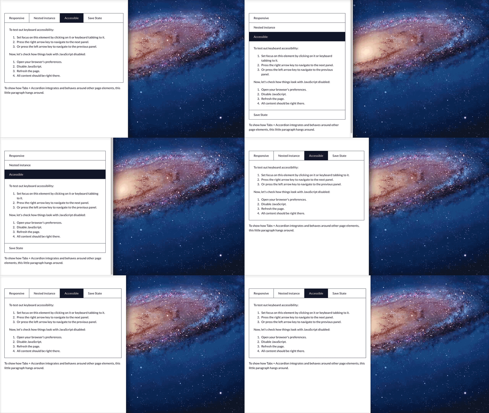
Accordion is completely responsive. It scales from big to small in no time. For Tabs, there is Responsive Switch.
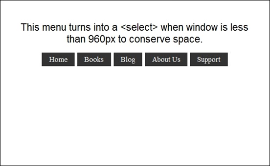
Menu to a Dropdown for Small Screens – MORE INFO / DEMO
This plugin works by converting a regular row of links into a dropdown menu when the browser window is narrow.
Little Boxes Responsive Grid – MORE INFO / DEMO
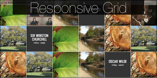
Little Boxes Responsive Grid is a jQuery templating item that let you display your videos, images and articles on an expandable grid.
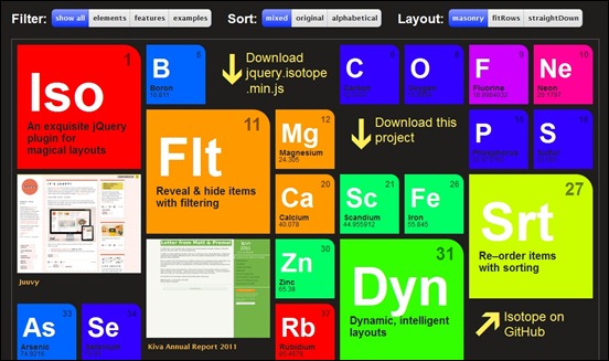
Isotope – MORE INFO / DEMO
Isotope features an intelligent and dynamic layouts that can’t be achieved with CSS alone. It re-orders item elements with sorting. Sorting data can be extracted from just about anything.
Flare Responsive Mobile-Optimized Lightbox Plugin – MORE INFO / DEMO
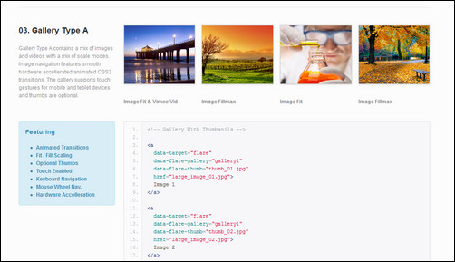
Flare is a responsive mobile-friendly lightbox jquery plugin with many different lightbox features, image, gallery, video etc.
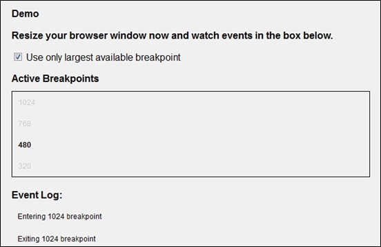
Breakpoints.js – MORE INFO / DEMO
Define breakpoints for your responsive design, and Breakpoints.js will fire custom events when the browser enters and/or exits that breakpoint.
FrameIt – Responsive jQuery Plugin – MORE INFO / DEMO

This plugin works on mobile devices, smartphones and desktop without loss functionality. It is “responsive”, which means it’s 100% compatible with responsive web designs. It effectively allows you to give a touch of life to images, ready for use on presentations, personal web portfolios or simply, a scroll of images. FrameIt does all the work, you choose where to use.
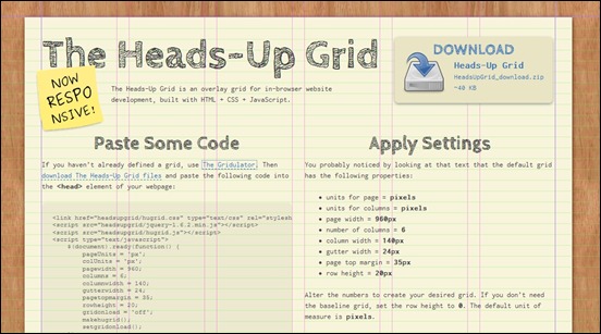
The Heads-Up Grid – MORE INFO / DEMO
The Heads-Up Grid is an overlay grid for in-browser website development, built with HTML + CSS + JavaScript.
uSquare – Universal responsive grid html5/jquery – MORE INFO / DEMO

uSquare is a responsive squared grid that can display your content in a unique and interesting way. You can use it for displaying team members, products, services, designs, blog posts or anything else that comes to your mind. In our live preview we have included 3 modifications of the original file in order for you to see how uSquare can serve your purpose.
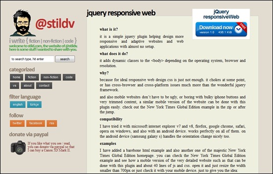
jquery responsive web – MORE INFO / DEMO
jquery responsive web it is a simple jquery plugin helping design more responsive and adaptive websites and web applications with almost no setup.
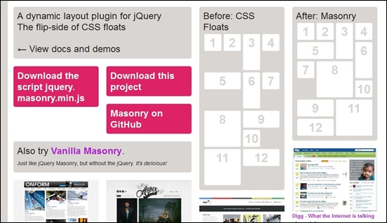
jQuery Masonry – MORE INFO / DEMO
Masonry is a dynamic grid layout plugin for jQuery. Think of it as the flip-side of CSS floats. Whereas floating arranges elements horizontally then vertically, Masonry arranges elements vertically, positioning each element in the next open spot in the grid. The result minimizes vertical gaps between elements of varying height, just like a mason fitting stones in a wall.
RoyalSlider – Touch-Enabled jQuery Image Gallery – MORE INFO / DEMO
RoyalSlider is easy to use responsive jQuery image gallery with animated captions, responsive layout and touch support for mobile devices. Easily add unlimited number of slides and captions. Use it as image slider, image gallery, banner rotator, banner ads, or even presentation.
Slider Revolution Responsive jQuery Plugin – MORE INFO / DEMO
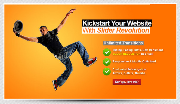
Turn simple HTML markup into a responsive(mobile friendly) or fullwidth slider with must-see-effects and meanwhile keep or build your SEO optimization (all content always readable for search engines). See the heaps of custom transitions/animations for each object on the page! Customize this slider with just a little HTML and CSS to your very needs.
This plugin features tons of unique transition effects, an image preloader, video embedding, autoplay that stops on user interaction and lots of easy to set options to create your own effects. All customization can be handled via jQuery Options, HTML 5 data-attributes and CSS !
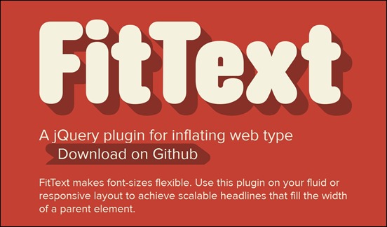
FitText – MORE INFO / DEMO
FitText makes font-sizes flexible. Use this plugin on your fluid or responsive layout to achieve scalable headlines that fill the width of a parent element.
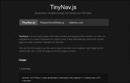
TinyNav.js – MORE INFO / DEMO
TinyNav.js is a tiny jQuery plugin (362 bytes minified and gzipped) that converts <ul> and <ol> navigations to a select dropdowns for small screen. It also automatically selects the current page and adds selected=”selected” for that item.
Responsive Menu – MORE INFO / DEMO
A Plugin which turns your site’s navigation into a dropdown (<select>) when your browser is at mobile widths.
Responsive Horizontal Layout with jQuery & CSS3 – MORE INFO / DEMO
The idea of this script is to make each panel individually scrollable and animate a content panel to the left of the viewport once it’s clicked or selected from the menu. The challenge is to deal with different viewport sizes meaning that it will change the layout if the screen is not wide enough in order to be stacked vertically instead of horizontally.
Glisse.js – MORE INFO / DEMO
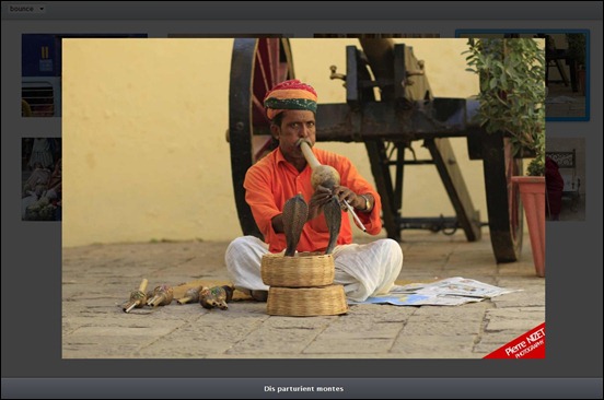
Glisse.js is a simple, responsive and fully customizable jQuery photo viewer. You’ll like the transitions between two pictures entirely assumed by CSS3.
FitVids.js – MORE INFO / DEMO
A lightweight, easy-to-use jQuery plugin for fluid width video embeds.
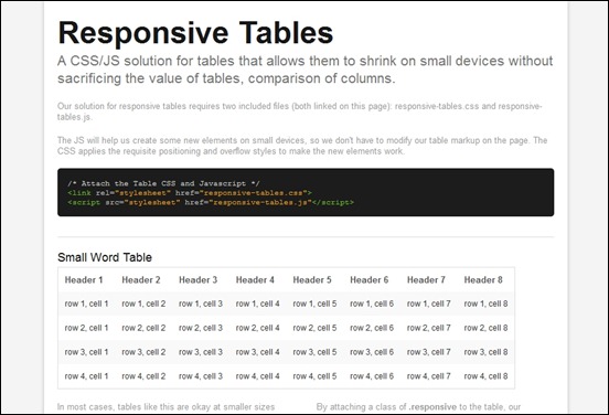
Responsive Tables – MORE INFO / DEMO
A CSS/JS solution for tables that allows them to shrink on small devices without sacrificing the value of tables, comparison of columns.
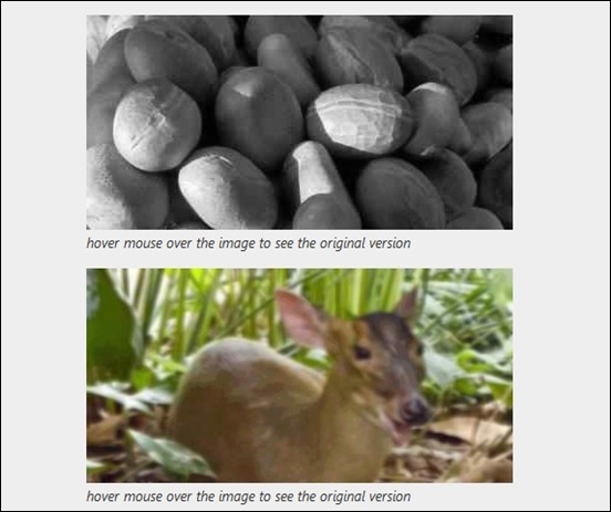
Hoverizr – MORE INFO / DEMO
Hoverizr is a really small (2.5KB minified) responsive jQuery plugin that outputs manipulated images on top (or below) your targeted images. Currently, it features three effects: grayscale, blur and color inversion. Automatically when you move your mouse over the target elements, the element above fades out to reveal the element beneath whether it is the original image or the manipulated one.
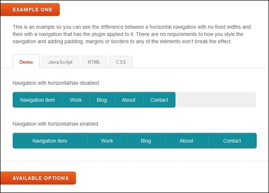
HorizontalNav – MORE INFO / DEMO
HorizontalNav is a jQuery plugin that spans a horizontal navigation to fit the full width of it’s container. If you’ve ever had to create this effect on a project, you’ll know it’s pretty annoying to do. But this plugin makes it easy and adds support for IE7.
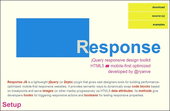
Response.js MORE INFO / DEMO
Response JS is a lightweight jQuery (or Zepto) plugin that gives web designers tools for building performance-optimized, mobile-first responsive websites. It provides semantic ways to dynamically swap code blocks based on breakpoints and serve images (or other media) progressively via HTML5 data attributes. Its methods give developers hooks for triggering responsive actions and booleans for testing responsive properties.
Doubletake – MORE INFO / DEMO
Doubletake is a jQuery plugin for responsive image. Doubletake dynamically updates the src of your images based on the browser width. Start with a small, mobile-friendly image in your HTML. Doubletake will use a defined set of breakpoints to update image SRCs when necessary.
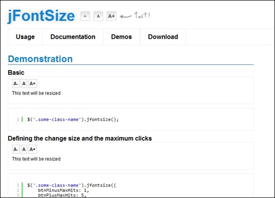
jFontsize – MORE INFO / DEMO
The jFontSize plugin was developed to facilitate the process of creating the famous buttons A+ and A-, which alter the font size on sites with very large texts, such as blogs, journals, tutorials, etc. This tool is also used to increase the accessibility of sites, helping people who have visual problems to see better content.
rlightbox – MORE INFO / DEMO
rlightbox is a jQuery UI mediabox that can display many types of content such as images, YouTube and Vimeo videos. It has many unique features like Panorama and Live Re-size. Like other jQuery UI widgets, it is ThemeRoller ready.
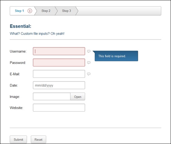
Ideal Forms – MORE INFO / DEMO
Ideal Forms is the ultimate framework for building and validating responsive HTML5 forms. It features fully responsive (AKA adaptive, adapts to the container, no css media queries needed). Also, every input type can be customized including select, radio, checkbox and file.



![doubletake[5] doubletake[5]](https://creativecan.com/wp-content/uploads/2012/08/doubletake5_thumb.jpg)





5 Responses to “25 Awesome jQuery Plugins for Responsive Layout”
November 1, 2012
Craig GwambaGreat collection of plugins here. A lot of them are new to me and I will definitely be using them in my next few projects.
Great article, precise and informative. Well done.
Craig @ Teknicom Web Solutions
November 2, 2012
anne.sofieHi Craig, thank you for this great comment on our article. Just glad we could help 🙂
Best regards,
Sofie
May 13, 2013
DjordjeThis is great , but what if the Javascript is disabled in browser ?