
Creating websites with responsive layouts is one of the hottest trends in web design right now. This is obviously driven by the dramatic increase of mobile Internet users and a need to give mobile users a good experience. Creating fully a responsive web layout is a challenging task for web developers because the web pages need to adapt to fit across a wide range of screen sizes, ie. from desktop computer monitors to small mobile phones.
Designers have to design multiple layouts that fit well to different ranges of view ports and orientation (basically the available screen space), and it is certainly more work compared to non responsive websites. Developers also have more work to so and they usage CSS media queries to style the layouts defined at design time. CSS media queries makes it possible to apply different CSS styles based on the characteristics of the device at hand like, for example, screen size, device-orientation or display-density. As a whole, developing responsive websites is more complex and challenging, but the benefits of giving the mobile users a great experience makes it worth the effort.
Luckily, there are many useful responsive web design tools and responsive CSS frameworks you can use to avoid doing everything from scratch. In this article, I’m rounding up some of the best responsive tools and resources for creating responsive wireframing, responsive grid, testing responsive layouts and more. If you are a website owner who want a straightforward solution to make your website mobile-friendly, you can shortcut the process by using a responsive WordPress theme or a responsive HTML5 template. Check the responsive web design tools below and do not forget to share with us your thoughts. You can also share this article to your friends and coworkers. Enjoy!
Responsive Wireframing Tools and Templates
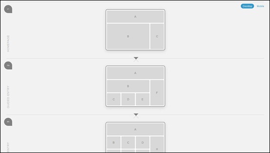
Responsive Layouts, Responsively Wireframed
This is a demonstration by James Mellers, illustrates how a series of pages could work across these different devices, by simulating how the layout of each page would change responsively, to suit the context. Just use the buttons top-right to toggle between desktop and mobile layouts and see the difference.
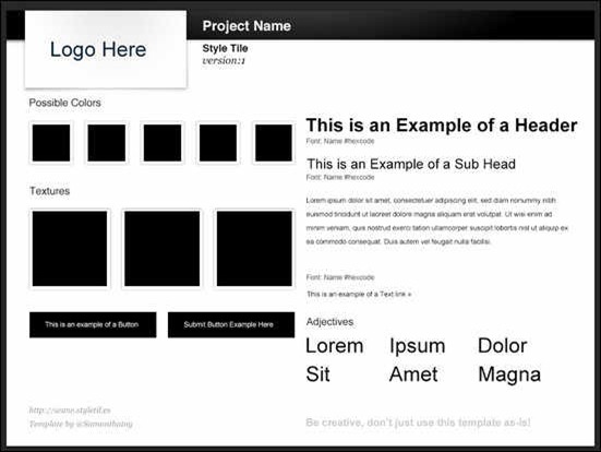
Style Tiles
Style Tiles is a design deliverable consisting of fonts, colors and interface elements that communicate the essence of a visual brand for the web.
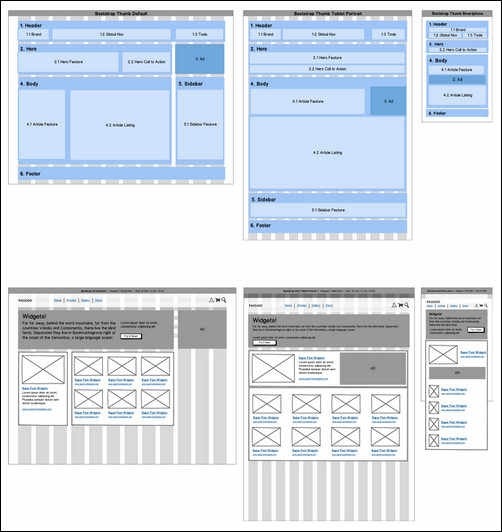
Wireframing Responsive Designs with Mockups
Tutorial on how to do wireframing for responsive layouts and you will also find a library of mockup templates
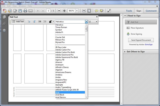
Responsive Web Design Sketch Sheets
This tool is a useful aid in mapping out the placement of elements across various devices. With this tool, you can have an idea where to place the the elements of the web page in different sizes of browsers.
Multi-Device Layout Patterns
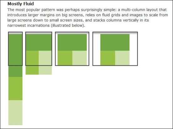
Multi-device layout patterns are collections of popular patterns commonly used by designers in making responsive layouts. It shows how websites adapt to different screen resolutions and how they display the page elements with the variation of screens sizes.
Responsive Design Sketchbook
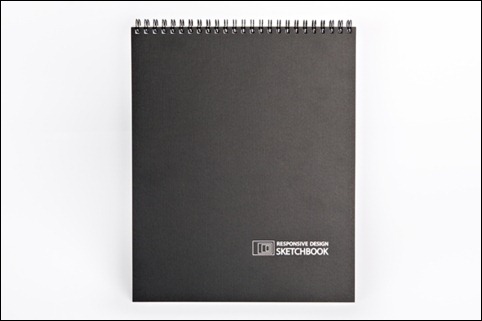
Quickly map out your responsive site with the Responsive Design Sketchbook. Inspired by “Responsive Web Design” by Ethan Marcotte, this new sketchbook has a multi-grid front page for thumbnail sketches of multiple viewports. The back page is a single blueprint page with break point indicators.
Simple Device Diagram
This device is a handy tool in responsive website design planning. It simplifies the process of choosing what device widths to design to. It outlines the ideal width for the design for 3 layout sites, 4 layout sites, etc.
The Responsive Calculator
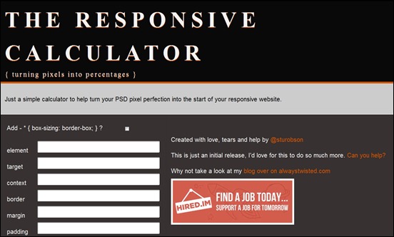
Just a simple calculator to help turn your PSD pixel perfection into the start of your responsive website.
Resizer
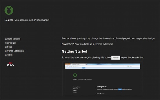
Resizer allows you to quickly change the dimensions of a webpage to test responsive design.
Responsive grids and frameworks
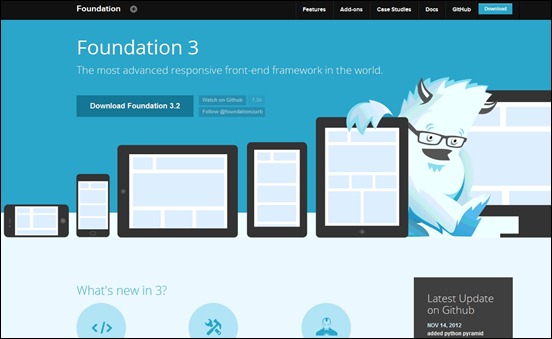
Foundation 3 – advanced responsive front-end framework from Zurb
You’ve probably used a grid framework before — we think you’ll like this one. It’s a 12-column flexible grid that can scale out to an arbitrary size (defined by the max-width of the row) that’s also easily nested, so you can build out complicated layouts without creating a lot of custom elements. And when the Grid isn’t enough for your site, it just gets out of the way.
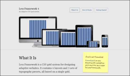
Less Framework 4
Less Framework is a CSS grid system for designing adaptive websites. It contains 4 layouts and 3 sets of typography presets, all based on a single grid.
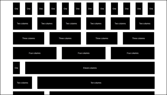
1140 CSS Grid
The 1140 grid fits perfectly into a 1280 monitor. On smaller monitors, it becomes fluid and adapts to the width of the browser. Beyond a certain point it uses media queries to serve up a mobile version, which essentially stacks all the columns on top of each other so the flow of information still makes sense. Although the the best resolution for this CSS grid is a 1280px, still it works equally well with 1024px screen as everything can still be seen just like in 1280px monitor and all the way down to the mobile screens. It is a great tool for designers as one design, ie., 1280px fits all screen sizes. There is no need to declare inline sizes for images as they get re-sized down smaller.
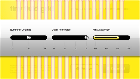
Tiny Fluid Grid
Tiny Fluid Grid is an awesome web based app that can help you determine the grid system of your design. By setting the number of columns, gutter percentage and minimum and maximum widths of your design, the app can give you a downloadable CSS of your responsive grid.
Gridset
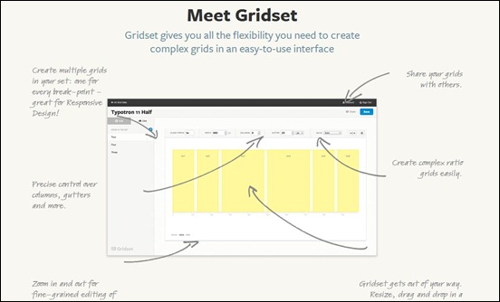
Gridset is an online tool that allows you to build fully bespoke, responsive grid systems without touching any of the difficult Maths, freeing you to focus on your design. It allows you to create complex grid systems for your design in minutes and tailor specific grids across breakpoints to suit multiple screen sizes. You can also create, save and reuse grids, and edit them whenever you like and share and collaborate on your grids easily with others.
Fluid Grids
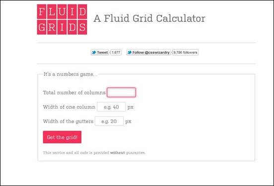
Fluid Grid Calculator is a nice tool that you can use to generate CSS for you fluid grid design. All you have to do is to enter the number of columns and the sizes of the columns and the gutters.
Simple Grid
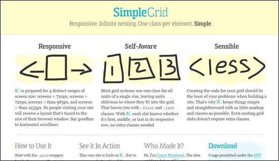
Creating the code for your grid should be the least of your problems when building a site. That’s why SG keeps things simple and straightforward with as little markup and classes as possible. Even nesting grid slots doesn’t require extra classes.
Susy
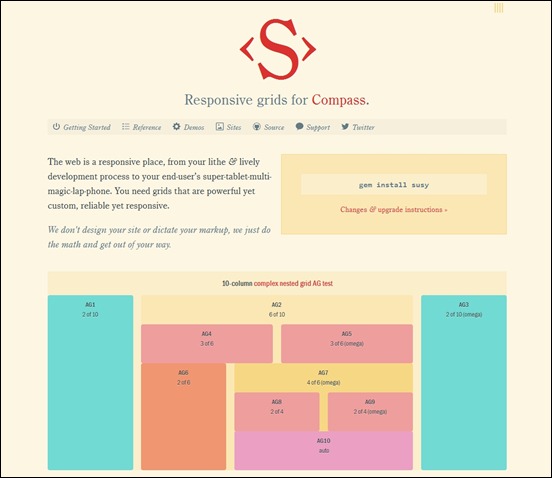
Responsive Susy grids allow you to change the number of columns in a layout at different window sizes, using @media-queries with min and max widths.
Flurid – The Fluid CSS Grid Framework
Flurid is a cross-browser fluid width grid system optimized for flexibility (fluidity) and one of the only fluid width grid systems to work in Internet Explorer versions 5.0 and newer without hiding pixels in margins. Like any grid system, the basic purpose is to break the page into a series of rows and columns, giving the designer an easy, rational way to organize and present content to the user.
ProtoFluid
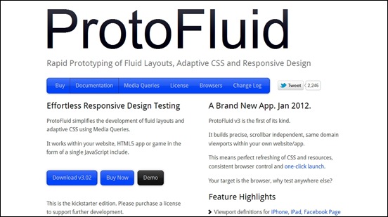
Protofluid is a tool that makes it possible to do rapid prototyping of Fluid Layouts, Adaptive CSS and Responsive Design. ProtoFluid simplifies the development of fluid layouts and adaptive CSS using Media Queries. It works within your website, HTML5 app or game in the form of a single JavaScript include.
Golden Grid System
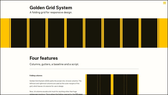
Golden Grid System is a folding grid that can be used as a starting point in responsive web design. Golden Grid System (GGS) splits the screen into 18 even columns. The leftmost and rightmost columns are used as the outer margins of the grid, which leaves 16 columns for use in design. The 16 columns can be combined, or folded, into 8 columns for tablet-sized screens, and into 4 columns for mobile-sized ones. This way GGS can easily cover any screen sizes from 240 up to 2560 pixels. The author, Joni Korpi, has a very good advice to its users. Don’t use GGS as it is. “Take it apart, steal the parts that you like, and adapt them to your own way of working,” he said.
Bootstrap
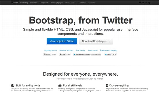
Bootstrap provides simple and flexible HTML, CSS, and Javascript for popular user interface components and interactions. In other words, it’s a front-end toolkit for faster, more beautiful web development. It’s created and maintained by Mark Otto and Jacob Thornton at Twitter.
Mobile Boilerplate
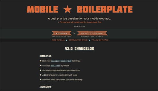
Mobile Boilerplate is a base template created by the developers of HTML5 Boilerplate, to help mobile developers create mobile web applications quickly. It features cross-browser viewport optimization for Android, iOS, Mobile IE, Nokia and Blackberry. Also it supports Apache server caching, compression, and other configuration defaults.
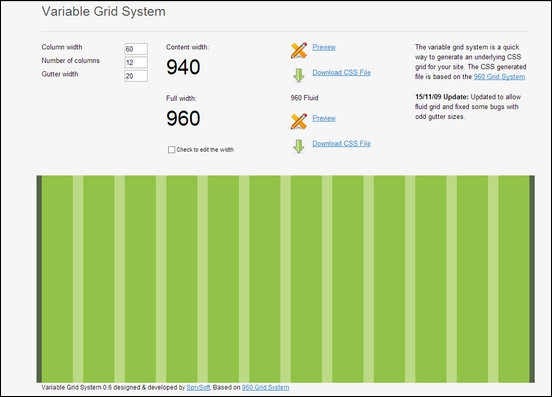
Variable Grid System
The variable grid system is a quick way to generate an underlying CSS grid for your site. The CSS generated file is based on the 960 Grid System.
1KBCSSGrid
Designed by Tyler Tate, is a simple and lightweight CSS Grid generator. It will allow you to set the number of columns, column width and gutter width, and you can get a downloadable CSS for your websites grid.
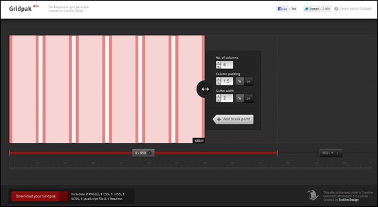
Gridpak
Gridpak is the starting point for your responsive projects, improving your workflow and saving time. Create your responsive grid system once using the simple interface and let Gridpak do the heavy lifting by generating PNGs, CSS and JavaScript.
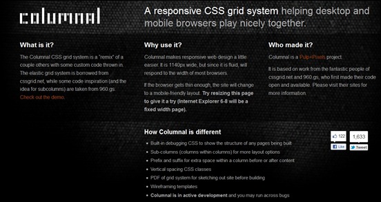
Columnal
Columnal is a responsive CSS grid system helping desktop and mobile browsers play nicely together. It is 1140px wide, but since it is fluid, will respond to the width of most browsers. If the browser gets thin enough, the site will change to a mobile-friendly layout.
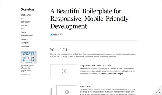
Skeleton
Skeleton is a small collection of CSS & JS files that can help you rapidly develop sites that look beautiful at any size, be it a 17″ laptop screen or an iPhone.
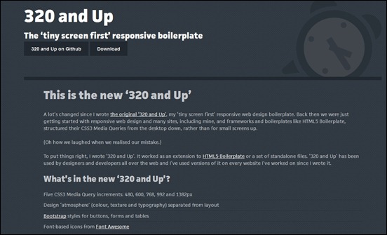
320 and Up
The common practice in responsive web designing is to begin with full size desktop as a starting point and from there make scales in smaller screen sizes. The creators of 320 and Up have it on the reverse. They said that you should start designing in small browsers and from then work your way up. The updated version of 320 and up features, Five CSS3 Media Query increments: 480, 600, 768, 992 and 1382px; Design ‘atmosphere’ (colour, texture and typography) separated from layout; Bootstrap styles for buttons, forms and tables and more.
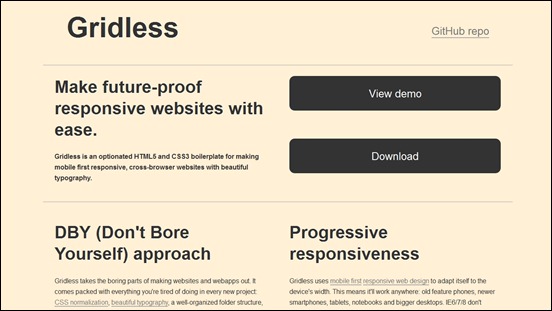
Gridless
Gridless is an optionated HTML5 and CSS3 boilerplate for making mobile first responsive, cross-browser websites with beautiful typography.
Responsive Scripts
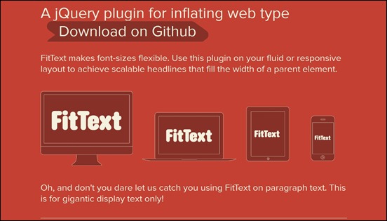
FitText
FitText makes font-sizes flexible. Use this plugin on your responsive design to achieve scalable headlines that fill the width of the parent element. This jQuery plugin works by inflating the web type to fill its parent element. That is why you still get a full width text no matter what the size of your screen is. It works well with Lettering.js, or any CSS3 property you throw on it.
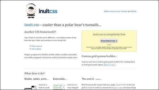
inuit.css
inuit.css is a CSS framework equipped with a plugins called igloos, that extend the core framework to add more specific functionality. It has a custom grid system builder for creating fixed or fluid grid system igloos.
Slabtext
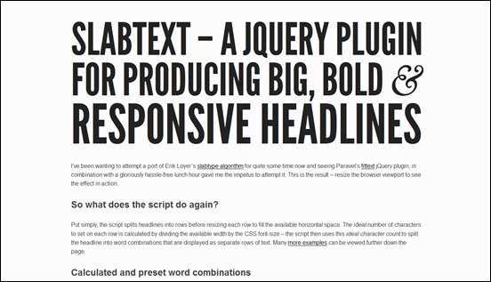
Slabtext is a jQuery plugin for producing big, bold & responsive headlines. Put simply, the script splits headlines into rows before resizing each row to fill the available horizontal space. The ideal number of characters to set on each row is calculated by dividing the available width by the CSS font-size – the script then uses this ideal character count to split the headline into word combinations that are displayed as separate rows of text.
Respond.js
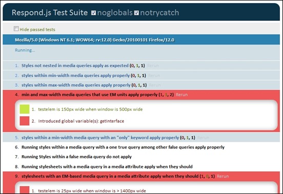
Respond.js is a fast & lightweight polyfill for min/max-width CSS3 Media Queries (for IE 6-8, and more). The goal of this script is to provide a fast and lightweight (3kb minified / 1kb gzipped) script to enable responsive web designs in browsers that don’t support CSS3 Media Queries – in particular, Internet Explorer 8 and under. It’s written in such a way that it will probably patch support for other non-supporting browsers as well.
Adapt.js
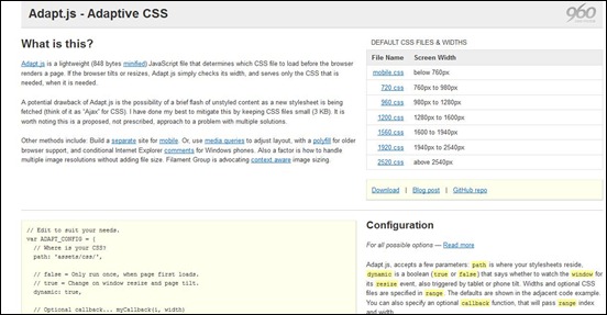
Adapt.js is a lightweight JavaScript file that determines which CSS file to load before the browser renders a page. If the browser tilts or resizes, Adapt.js simply checks its width, and serves only the CSS that is needed, when it is needed.
TinyNav.js
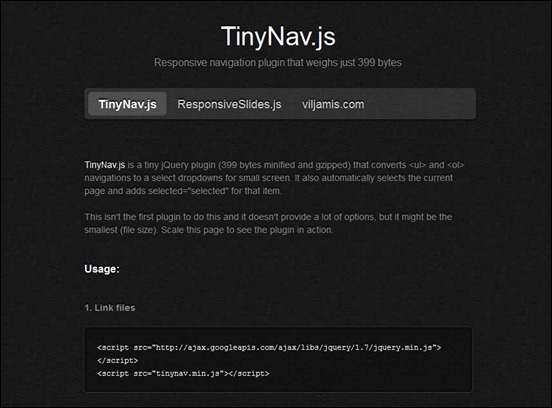
TinyNav.js is a tiny jQuery plugin (399 bytes minified and gzipped) that converts <ul> and <ol> navigations to a select dropdowns for small screen. It also automatically selects the current page and adds selected=”selected” for that item.
Swipe
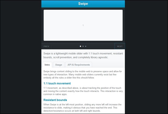
Swipe is a lightweight mobile slider with 1:1 touch movement, resistant bounds, scroll prevention, and completely library agnostic. Swipe brings content sliding to the mobile web to preserve space and allow for new types of interaction. Many mobile web sliders currently exist but few embody all the rules a slider like this should follow.
The Wookmark jQuery plugin
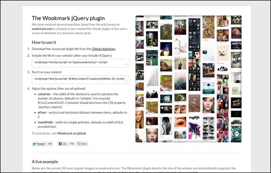
This is a jQuery plugin for laying out a dynamic grid of elements. The Wookmark plugin detects the size of the window and automatically organizes the images into columns. Resize your browser to see the layout adjust. Note how the columns are approximately of equal height.
Fitvids.js
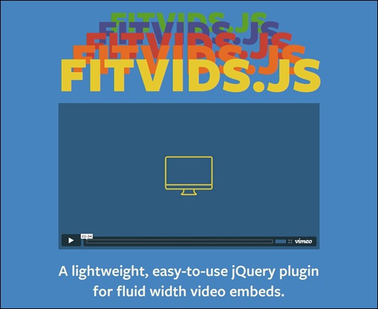
A lightweight, easy-to-use jQuery plugin for fluid width video embeds.
mediaQuery Bookmarklet
The mediaQuery bookmarklet gives a visual representation of the current viewport dimensions and most recently fired media query.
Responsive Data Table Roundup
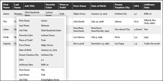
These collection of table curated by Chris Coyier, discuss how tables should appear as screen size decreases. It is complete with examples and source codes that you can look at as an aid for your own responsive web design.
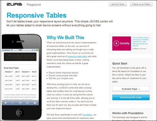
Responsive Tables by Zurb
A CSS/JS solution for tables that allows them to shrink on small devices without sacrificing the value of tables, comparison of columns.
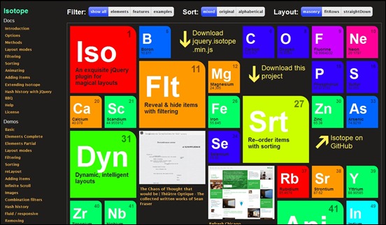
Isotope
Isotope is an exquisite jQuery plugin for magical layouts. In you are creating a responsive design, it can help you rearrange the elements of a web page when the browser is resized and is also useful in filtering such elements.
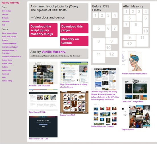
jQuery Masonry
Masonry is a dynamic grid layout plugin for jQuery. Think of it as the flip-side of CSS floats. Whereas floating arranges elements horizontally then vertically, Masonry arranges elements vertically, positioning each element in the next open spot in the grid. The result minimizes vertical gaps between elements of varying height, just like a mason fitting stones in a wall.
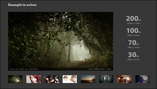
Adaptive Images
Adaptive Images detects your visitor’s screen size and automatically creates, caches, and delivers device appropriate re-scaled versions of your web page’s embeded HTML images. No mark-up changes needed. It is intended for use with Responsive Designs and to be combined with Fluid Image techniques.
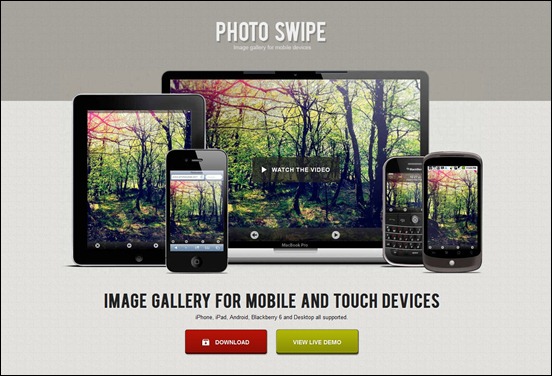
PhotoSwipe
PhotoSwipe is a self contained JavaScript library that can be easily integrated into your mobile websites. It is heavily optimized for mobile webkit browsers. However, if you need wider desktop browser support or you are using jQuery Mobile, PhotoSwipe comes packaged with a jQuery implementation as well.
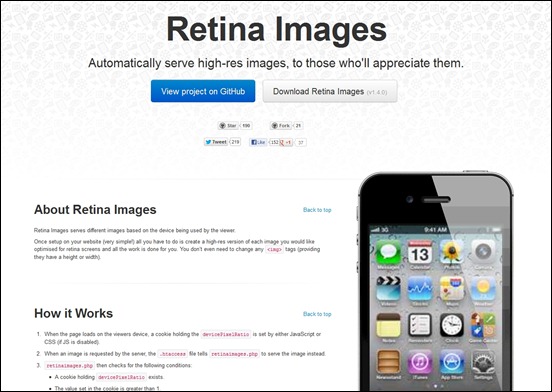
Retina Images
Retina Images serves different images based on the device being used by the viewer. Once setup on your website (very simple!) all you have to do is create a high-res version of each image you would like optimised for retina screens and all the work is done for you. You don’t even need to change any <img> tags (providing they have a height or width).
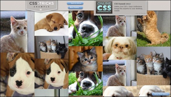
Seamless Responsive Photo Grid
Seamless Responsive Photo Grid is a grid that you can use to make images display edge-to-edge on the browser window with no gaps. The idea behind this trick by Chris Coyier is to tile the photos and make them flow in a series of columns from left to right all throughout the page. By setting the images width to 100%, they will take up exactly the width of one column. The number of columns depends of the size of the browser. As the screen size becomes smaller, the grid works by having media queries test the browser width and adjust the number of columns accordingly. You can resize your browser all around and watch things move very quickly.
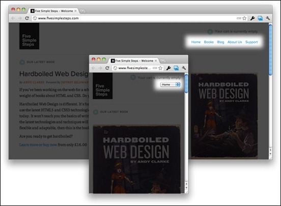
Convert a Menu to a Dropdown for Small Screens
Chris Coyier discusses how to make a navigation menu convert into a dropdown when you are browsing the website on a small screen. That’s a better choice than a tiny link.
Tools for testing Responsive layouts
Responsive PX
This works by loading your website and displaying the portion visible on different screen sizes. You can adjust the width and the height of the display to simulate the resolution of different devices.
The responsinator
The Responsinator helps website makers quickly get an indication of how their responsive site will look on the most popular devices. It does not precisely replicate how it will look, for accurate testing always test on the real devices.
Aptus by Moople
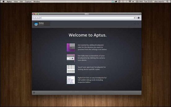
Aptus is a dedicated browser that lets you preview, edit and screenshot your responsive site at any size from mobile through to large desktop. Focus your responsive workflow with a tool that doesn’t rely on bookmarklets, restrictive pre-defined breakpoints – or even a web connection. Aptus improves on web-based tools by letting you create and work on multiple breakpoints simultaneously, even setting custom user agents if required. Aptus also allows you to preview and debug fluid variations inside your media queries with our unique “Range” functionality – all without having to resize your browser ever again.
Screenfly
Screenfly allows you to view your website on a variety of device screens and resolutions. Enter a URL and click on GO to get started.
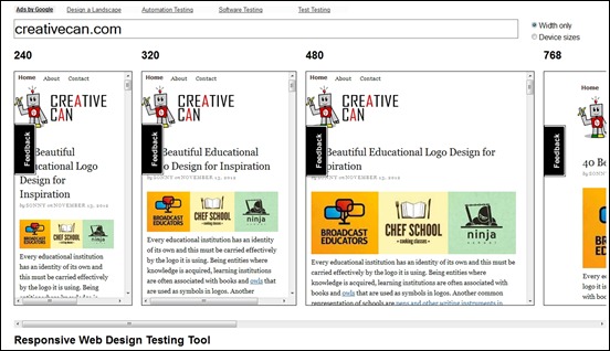
Responsive Web Design Testing Tool
Another testing tool that can provide you with a view of your website in different screens sizes is this web app. It displays your webpage simultaneously after you have entered your URL. It can help you help with testing your responsive websites while you design and build them.
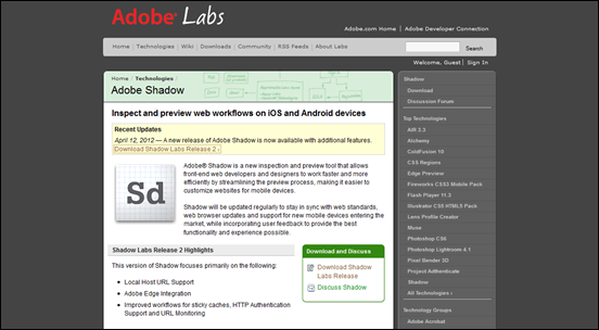
Adobe Shadow
Adobe Shadow is a new inspection and preview tool that allows front-end web developers and designers to work faster and more efficiently by streamlining the preview process, making it easier to customize websites for mobile devices.
Inspiration for Responsive web design
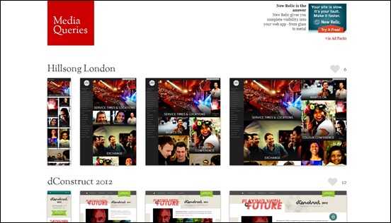
Media Queries
Media Queries has a sizeable collection of responsive web designs that you can see as inspirations for your design.



![flurid[3] flurid[3]](https://creativecan.com/wp-content/uploads/2012/11/flurid3_thumb.jpg)
![1kb-css-grid[3] 1kb-css-grid[3]](https://creativecan.com/wp-content/uploads/2012/11/1kb-css-grid3_thumb.jpg)

![responsive-px[1] responsive-px[1]](https://creativecan.com/wp-content/uploads/2012/11/responsive-px1_thumb.jpg)
![responsinator[3] responsinator[3]](https://creativecan.com/wp-content/uploads/2012/11/responsinator3_thumb.jpg)
![screenfly[1] screenfly[1]](https://creativecan.com/wp-content/uploads/2012/11/screenfly1_thumb.jpg)




Recent Comments
30+ Exciting WordPress Gaming Themes – Want Unfair Advantages?
60+ Beautiful Tri-Fold Brochure Designs and Premium Brochure Templates
30+ Exciting WordPress Gaming Themes – Want Unfair Advantages?