
In web design, hand-drawn elements and sketches are seldom used. Oftentimes, the graphic user interface and the entire look and feel of a website are created using some graphic design program. The background, the navigation buttons, the footer, the header and the logo are all designed to appear clean, colorful and sleek. That way, the website would appear professional and businesslike as it should be.
Meanwhile, if you are a creative and you want to add a personal touch on your website, one of the things that you can do is to use doodles on your web pages. That’s it. Simple hand-drawn illustrations, or doodles tend to be more friendly and lighthearted towards those who happen to see them. Thus, they tend to spark conversation more and generate positive responses.
Here in this article, we are showcasing cool and creative web designs for your inspiration. These websites are one of the world’s funkiest you can see about doodle inspired websites.
If you have any comments and suggestions, please write them down here. We are also inviting you to please share this article in the social media. Enjoy!
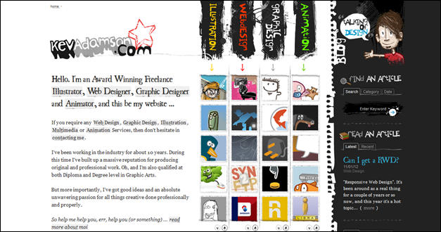
Kev Adamson
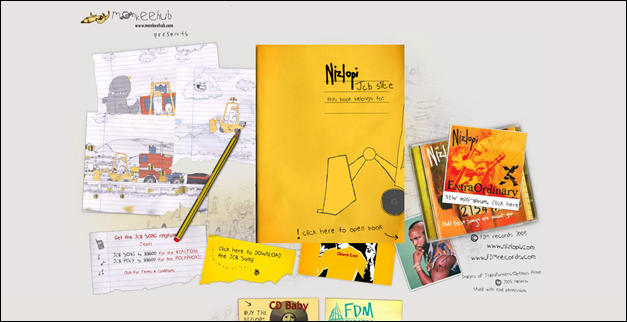
JCB
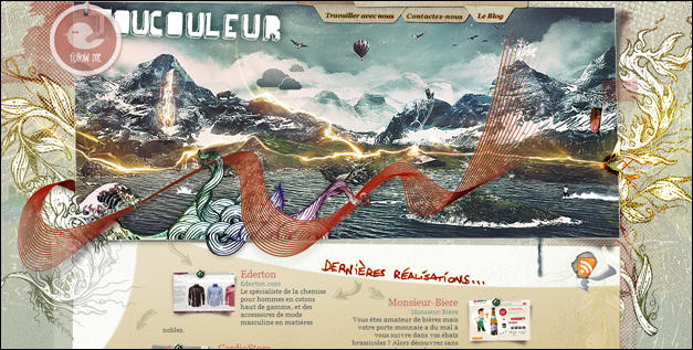
Toucouleur
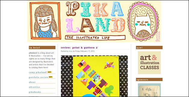
Pika Land
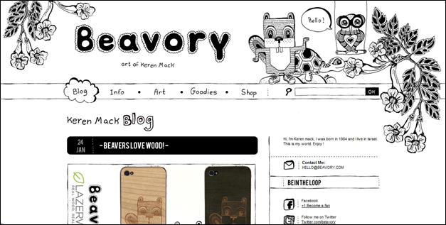
Beavory
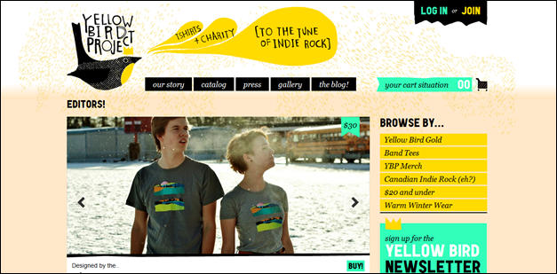
Yellow Bird Project
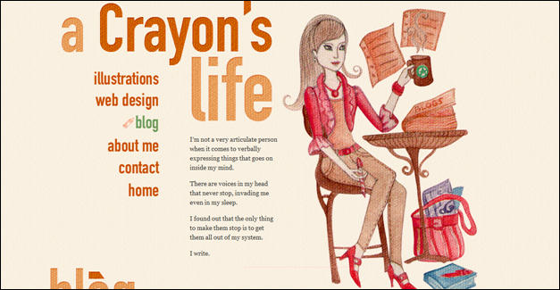
Crayon’s Life
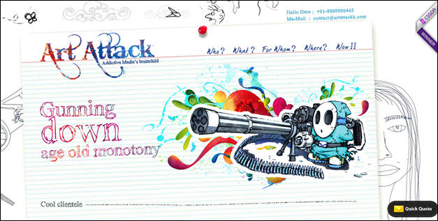
Art Attack Web Design
Just Dot Media Services
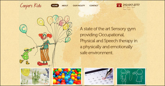
Coopers Kids
JOBY.in Design
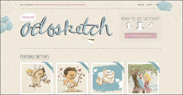
Odosketch
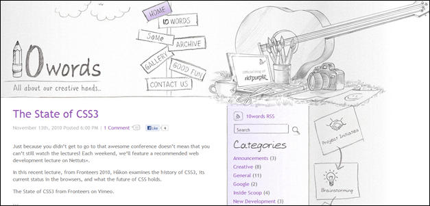
10 Words
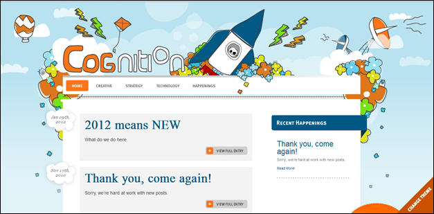
Cognition
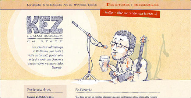
Kez Human Jukebox
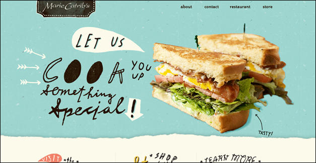
Marie Catrib’s
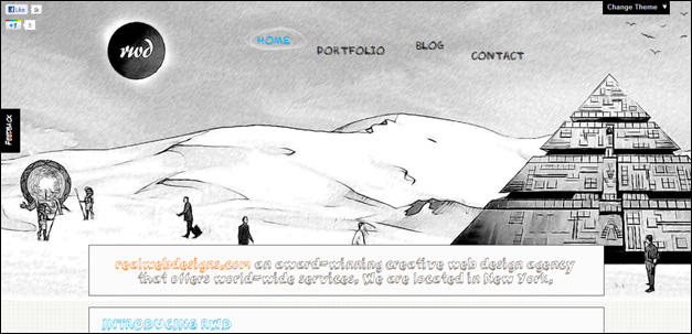
Real Web Designs
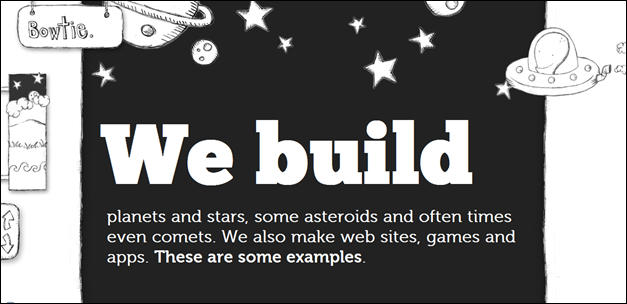
Bowtie
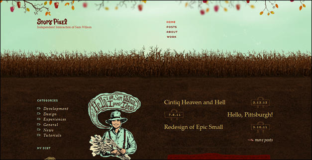
Story Pixel
London Made
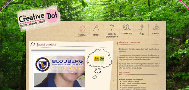
Creative Dot
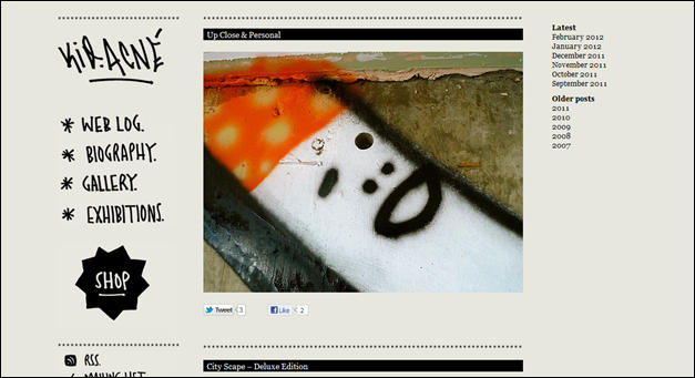
Kid Acne
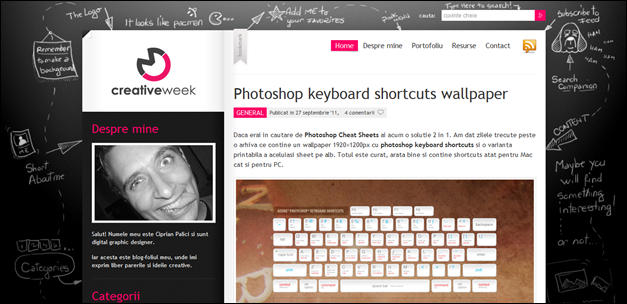
Creative Week
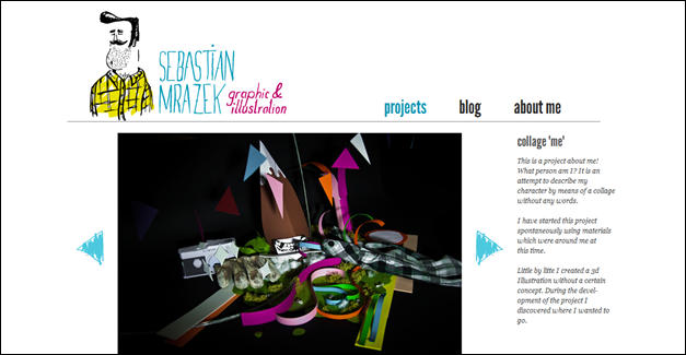
Sebastian Mrazek
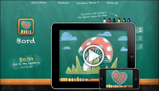
Bord
Hope you learn a lot and please give us feedback.







One Response to “25 Cool and Creative Use of Doodles in Web Design”
September 19, 2012
nermien BarakatVery nice